

20 Best construction fonts for your brand identity
TABLE OF CONTENTS


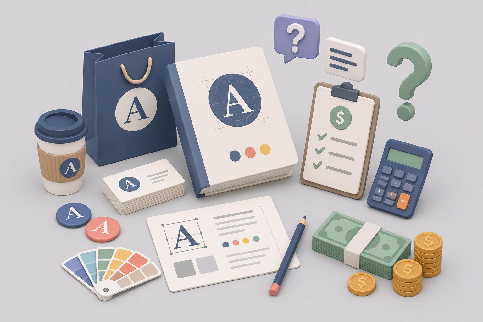
TL;DR
The best construction fonts are bold, geometric, and highly legible - traits that translate from a truck door to a business card without losing impact. This article lists 20 free (or nearly free) options including Montserrat, Obrazec, Exo 2, and Cornerstone. Jump straight to the full list or read on for guidance on choosing the right typeface for a construction brand.
Introduction
Typography is one of the most underestimated decisions in construction company branding. Yet the right font can make a business look established and trustworthy on a first site visit, while the wrong one can make even a well-run company look amateur.
Below you'll find 20 of the best free construction fonts, along with practical guidance on what to look for and when to use each one.
What makes a good construction font?
A construction font is a typeface that conveys strength, precision, and reliability; typically bold, geometric, or industrial in character. The best construction fonts work equally well on a hard-hat sticker, a truck livery, a business card, and a company logo. If a typeface falls apart at small sizes or disappears against a hi-vis background, it's not right for this industry.
There are four traits worth checking before committing to a typeface for construction branding:
- Weight. Bold to black weights are the norm. Thin or light fonts are hard to read at distance and signal fragility - the opposite of what a construction brand needs to communicate.
- Structure. Geometric and industrial typefaces (clean angles, consistent stroke widths, minimal decoration) mirror the precision of engineering and architecture. They read as professional rather than decorative.
- Legibility at scale. Construction fonts appear on building hoardings, vehicle wraps, safety signs, and business cards. A high x-height and open letter spacing keep things readable across that full range.
- Brand personality fit. "Construction" covers a wide spectrum: a heritage restoration firm has different needs than a modern civil engineering company. Bold serifs can project craftsmanship and heritage; clean geometric sans-serifs project precision and efficiency. Know which story you're telling before you choose.
With those criteria in mind, here are 20 of the best free construction fonts available today.
{{BRAND_BANNER="/dev/components"}}
30 Best Free Graphic Design Fonts for Construction Companies
1. Riven (free)
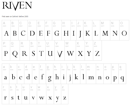
Riven is a bold display typeface with sharp, angular letterforms and deep V-cuts that give it a distinctly architectural feel. Its geometric precision is particularly striking in all-caps for construction company wordmarks — especially for names with strong consonant shapes. Available free at DaFont for personal and commercial use.
Best for: Logo wordmarks, site hoarding graphics, vehicle signage.
2. Nonchalance (free)
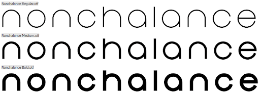
Nonchalance is a clean, professional sans-serif with refined proportions that sit comfortably between modern and classic. Its balanced letterforms make it a popular choice among architectural and construction firms that want to project precision without looking heavy-handed. Available free at DaFont for personal and commercial use.
Best for: Professional proposals, business cards, stationery.
3. Montserrat (free)
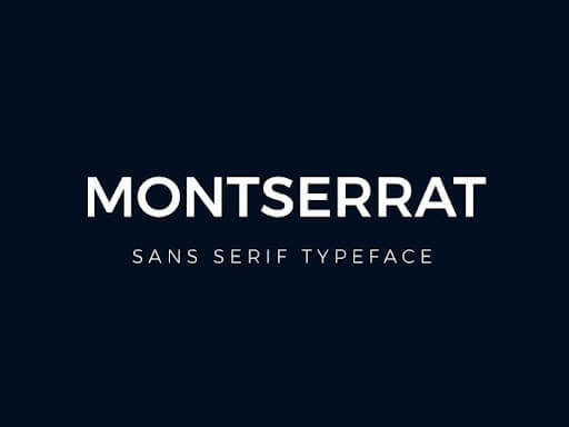
Montserrat was directly inspired by the posters and signage of the Montserrat neighborhood in Buenos Aires, giving it genuine urban and architectural heritage. Its geometric construction and wide weight range ( thin to extrabold) make it one of the most versatile free fonts for construction logos, websites, and marketing materials. Available free on Google Fonts under the Open Font License.
Best for: Full brand identity systems, websites, pitch decks.
4. Moderna (free)
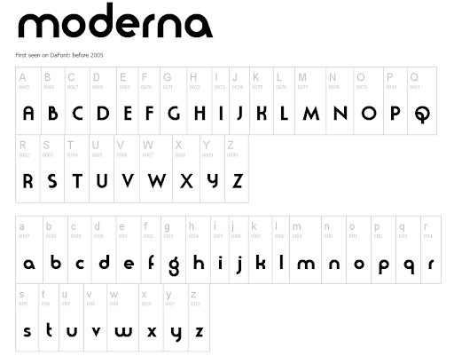
Moderna is a sleek, neutral sans-serif designed specifically for logos and headline use, with alternate characters and symbols that give designers room to create bespoke wordmarks. Its clean geometry and multiple variants make it easy to build a consistent look across truck liveries, hard-hat stickers, and site signage. Available free at FontsFree.
Best for: Logo design, branded equipment, signage.
5. Cornelia (free for personal use)
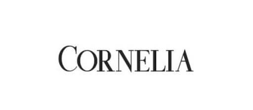
Cornelia is a font duo combining a serif and script typeface; for construction companies, the serif component is the standout — it projects confidence and authority without the rigidity of heavier display fonts. It works particularly well on company letterheads, client proposals, and premium construction brand identities targeting residential clients. Available at DaFont; free for personal use - verify commercial licensing before client work.
Best for: High-end residential builders, renovation and restoration brands, stationery.
6. Butler (free)

Butler is a serif display font that blends the elegance of the Bodoni family with the warmth of Dala Floda, producing a result that feels both authoritative and refined. With 334 characters across multiple styles and weights, it gives construction brands the typographic range to create a complete, cohesive brand system. Available free at DaFont.
Best for: Premium commercial construction, boutique development firms, brand guidelines.
7. Asterone (free for personal use)
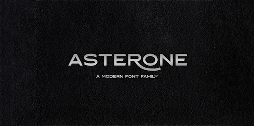
Asterone features strong geometric shapes with notable stroke contrast, making it ideal for construction companies that want to signal strength and solidity at first glance. It pairs naturally with simpler sans-serifs in brand collateral where headline contrast matters. Available at DaFont; free for personal use.
Best for: Logo headlines, branded signage, print advertising.
8. Adolphus (free)
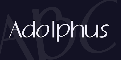
Adolphus is an elegant script font with fluid, confident strokes that suit higher-end construction and renovation brands targeting residential clients who value craftsmanship over industrial edge. It reads beautifully on business cards, letterheads, and embossed or engraved signage. Available free at 1001 Fonts.
Best for: Bespoke builders, heritage renovators, luxury fit-out companies.
9. Knucklehead (free)
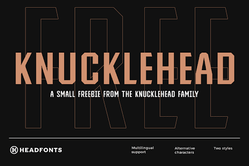
Knucklehead is a vintage-influenced display font family spanning ten typefaces, drawn from western American heritage and built entirely in uppercase. It suits construction companies with an established, blue-collar identity; think family-owned contracting firms or trades businesses that want to project decades of experience and community trust. Available free at DaFont; uppercase only.
Best for: Regional contractors, family trades businesses, heritage-positioned brands.
10. Obrazec (free)
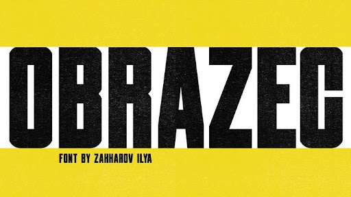
Obrazec is a no-nonsense industrial sans-serif with solid, block-like forms that immediately call to mind structural concrete and steel. Its strong visual weight holds up at both large scale on vehicle wraps and smaller scale on safety signage or branded PPE. Available free on Behance.
Best for: Heavy construction, civil engineering, plant hire and equipment brands.
11. Exo 2 (free)
.png)
Exo 2 is a geometric sans-serif from Google Fonts that blends technical precision with a modern, slightly futuristic edge — a natural fit for construction, engineering, and infrastructure brands. Its exceptionally wide weight range, from thin to black, means a single font family can handle your logo, subheadings, and body copy without needing a secondary typeface. Available free on Google Fonts under the Open Font License.
Best for: Civil engineering firms, infrastructure companies, tech-forward construction brands.
12. Lemon Milk (donationware)
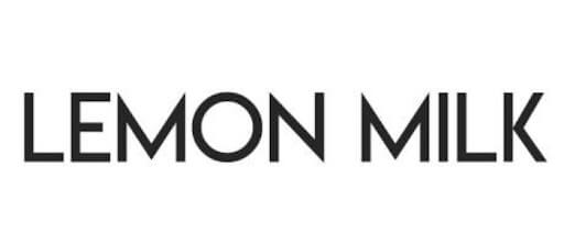
Lemon Milk features clean, rounded geometry and sharp angles that create a distinctly contemporary industrial feel without feeling aggressive. Its minimal, legible design works at scale on construction signage, site hoarding boards, and vehicle graphics, as well as at small sizes in digital use. Available as donationware on DaFont.
Best for: Modern construction companies, property developers, site hoardings.
13. Maveryk (free)
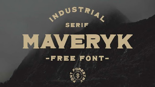
Maveryk is a thick industrial serif with rough, uneven edges that give it an authentic hand-crafted quality without sacrificing structural weight. It's the right choice when a construction brand wants to convey heritage and craftsmanship, particularly for restoration, renovation, or heritage building firms. Available free on Behance.
Best for: Restoration and renovation specialists, heritage builders, artisan trades.
14. Cornerstone (free)
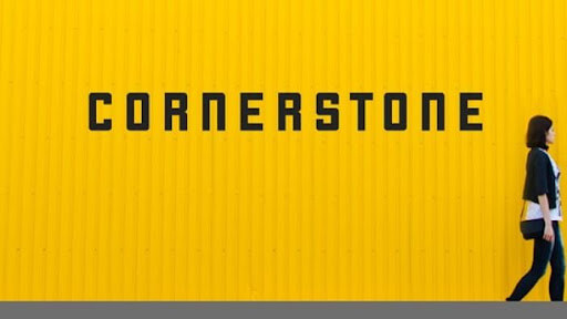
Cornerstone is a clean, minimalist geometric sans-serif with uniform stroke width and no-fuss letter construction. That simplicity is its strength: it translates perfectly from digital screens to safety barriers, workwear, and site boundary boards with zero loss of legibility. Available free on Behance.
Best for: General contractors, safety and compliance signage, branded workwear.
15. Mixolydian Titling (free)
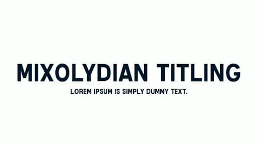
Mixolydian Titling draws directly from the U.S. Federal Highway Administration's Highway Gothic standard - the same letterform system used on road and construction zone signage across America. That lineage makes it an obvious choice for site boundary boards and any application where high legibility at distance is non-negotiable. Available free at 1001 Fonts.
Best for: Construction zone signage, road and infrastructure projects, site safety boards.
16. Market Deco (free for personal use)
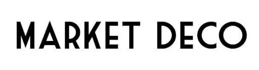
Art Deco typography is deeply rooted in architecture and construction. Market Deco is one of the cleanest and most restrained Art Deco options available, making it a strong choice for construction firms working in urban development, heritage renovation, or premium commercial builds. Available at DaFont; free for personal use: :verify commercial license before client work.
Best for: Urban developers, heritage and commercial renovation firms, premium brand identities.
17. Parking (donationware)
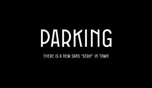
Parking is a condensed Art Deco sans-serif built entirely in all-caps with a strong vertical rhythm, giving it the feeling of signage from a grand public building or civic infrastructure project. Its tight letter spacing makes it particularly effective for wordmarks where horizontal space is limited. Available as donationware from Atipo Foundry.
Best for: Logo wordmarks, urban construction brands, architectural firm identity.
18. Architectural (free)
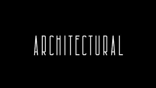
Architectural is a condensed, unusually tall display font whose elongated letterforms mirror the vertical geometry of building elevations. It works best at large display sizes, such as in building name boards, hoarding graphics, and premium brand identity for architecture-led construction firms. Available free at LocalFonts.
Best for: Architecture and construction firms, building name boards, premium display use.
19. Neothic (free)
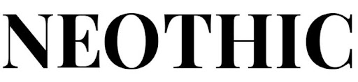
Neothic manages to be simultaneously strong and elegant: the distinctive Q ligature and refined stroke terminals set it apart from purely utilitarian construction fonts. It's a good choice for construction brands targeting premium residential or commercial clients where sophistication matters as much as solidity. Available free at DaFont.
Best for: Premium residential builders, boutique developers, high-end corporate identity projects.
20. The Bold Font (free)
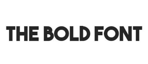
The Bold Font does exactly what its name promises: a heavy, full-weight geometric sans-serif with definitive shapes and maximum visual impact. It's one of the most straightforward options on this list, working reliably on a contractor's van, a site hoarding, a digital ad, or a business card without any adaptation. Available free at DaFont.
Best for: General-purpose construction branding, heavy plant, high-visibility applications.
Frequently asked questions about construction fonts
Finding the right construction font for your brand
A great font is only one piece of a strong construction company brand. Alongside typography, font pairings, color palette, logo construction, and consistent application across every touchpoint determine whether your brand looks like an industry leader or an afterthought. A great construction design service can help ensure your business looks the part and instill a sense of confidence with your clients.
ManyPixels works with construction and trades businesses to build complete brand identities: logos, brand guides, websites, and all the collateral in between. One flat monthly subscription, unlimited requests, and a dedicated designer who understands your industry.

Journalist turned content writer. Based in North Macedonia, aiming to be a digital nomad. Always loved to write, and found my perfect job writing about graphic design, art and creativity. A self-proclaimed film connoisseur, cook and nerd in disguise.

Top-quality designers
A complete creative team at your fingertips: graphic and web designers, illustrators, and more.

Lightning-fast turnaround
Get start today and receive your first update on the next business day.

All-inclusive pricing
Unlimited requests and revisions. One flat monthly fee. No surprises.

Flexible & scalable model
No contract. Scale up and down as needed. Pause or cancel at anytime.
Continue reading

Explore some of our best designs
Get inspired by a curated selection of ManyPixels work. Download the portfolio to see what our team can create.


