
Graphic design trends for 2026

TABLE OF CONTENTS

TL;DR
The biggest graphic design trend in 2026 isn't a single look, it's a reaction. After two years of AI-perfect visuals, the work getting attention now shows a human hand: hand-drawn marks, grain, imperfection, and bold personality.
✅ Safe bets that keep working: generative AI as a tool, 3D, and bold minimalism.
🚀 What's rising: purposeful maximalism, punk and grunge textures, retro-future nostalgia, and motion everywhere.
⚠️ The trap: chasing every trend at once and ending up looking like everyone else.
Graphic design is an ever-evolving field, and each year reshapes how brands look and feel. Below are 18 graphic design trends worth knowing in 2026, split into the ones still going strong and the ones breaking through this year.
What are graphic design trends?
Graphic design trends are the visual styles, techniques, and aesthetic choices that gain widespread popularity across branding, marketing, and digital design in a given period. They reflect shifts in technology, culture, and audience taste, which is why they change year to year rather than staying fixed.
Trends aren't rules. They're signals. A trend tells you what a lot of people are responding to right now, and following one well means understanding why it resonates, not just copying the surface look. The designers who use trends best treat them as a starting point and bend them to fit the brand.
Why 2026 is the year design pushed back on AI
The defining force in 2026 design isn't a new color or font. It's a backlash against AI-perfect visuals. As generative tools flooded feeds with slick, frictionless images, audiences started craving proof that a human made the thing in front of them. Almost every trend below is a version of that same instinct.
You can see it in the return of hand-drawn marks, grain, torn textures, and deliberate imperfection. It even shows up in color: Pantone named Cloud Dancer, a soft, quiet white, its 2026 Color of the Year, framing it as a calming counterweight to a frenetic, over-stimulated culture. In our own queue at ManyPixels, we've watched requests shift from "make it look premium and polished" toward "make it feel real and a bit handmade." That's the throughline for the year..
The irony is that AI adoption keeps climbing at the same time: 72% of designers now use generative AI in their workflows, according to Figma's State of the Designer 2026 report. The more designers lean on AI for speed, the more the finished work reaches for something a machine can't fake. In our own queue at ManyPixels, we've watched requests shift from "make it look premium and polished" toward "make it feel real and a bit handmade." That's the throughline for the year.
Trends still going strong in 2026
These carried over from recent years and show no sign of fading. If you adopted them already, keep going.
Generative AI as a creative collaborator
Generative AI in 2026 works best as a collaborator, not a replacement. Designers use tools like Midjourney and Firefly, and other AI tools to explore concepts, generate textures, and speed up early drafts, then refine the output with human judgment. The value is in faster exploration, not finished art.
The honest take: AI still can't replace a skilled designer. It's fast at variations and terrible at knowing which one is actually right for your brand. Used well, it removes the grunt work (background cleanup, quick color options, moodboards) so designers spend more time on the decisions that matter.
3D design and depth
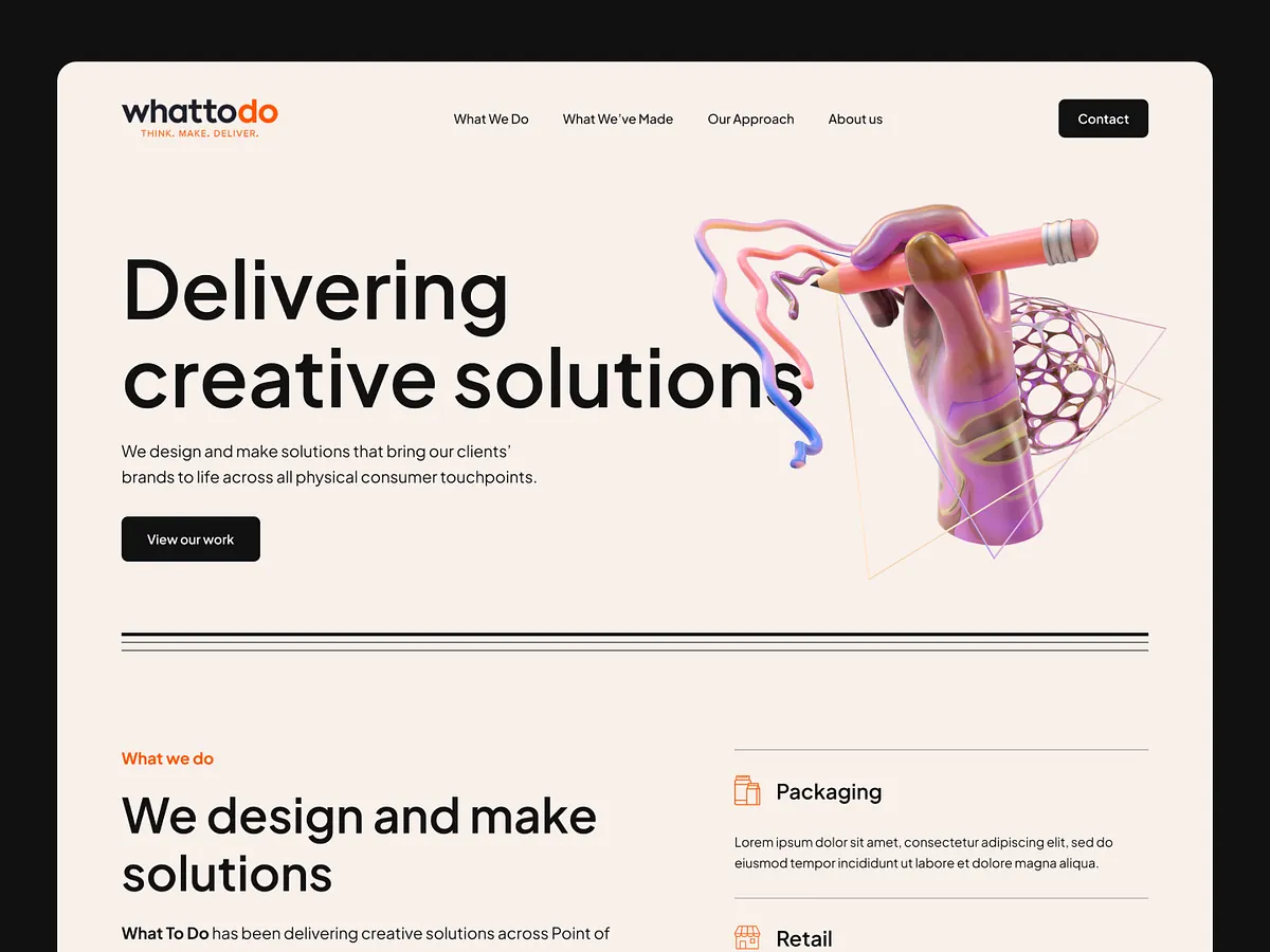
3D design remains one of the most durable graphic design trends because it makes flat layouts feel real and immersive. In 2026, it's used with more restraint: stylized, tactile forms that add depth to branding, packaging, and web design rather than dominating the whole composition.
The shift this year is away from spectacle and toward integration. A single sculptural 3D element in an otherwise clean layout reads as considered. A screen full of glossy 3D reads as dated.
Natural aesthetics
Nature-inspired design uses organic shapes, earthy palettes, and tactile textures to signal honesty, sustainability, and calm. It pairs well with eco-conscious brands and packaging, where the visual language needs to match a real commitment to materials and ethics.
In 2026 this feels grounded rather than decorative. Think muted greens and clays, hand-torn paper edges, and atmosphere over literal leaves-and-trees symbolism.

Bold minimalism
Minimalism is still here, but it grew a spine. Bold minimalism keeps the white space and restraint but adds high-contrast color, confident typography, and one strong focal point. It's clarity with presence instead of clarity that fades into the background.
Pantone's quiet 2026 white is proof minimalism isn't going anywhere. In minimalist design for web, this means more white space, tighter color schemes, and cutting anything that doesn't earn its place. Done badly it looks unfinished. Done well it looks expensive.

Hand-drawn illustrations
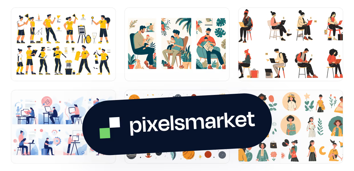
Hand-drawn illustration is having a real moment because it's the clearest possible signal that a human made the work. In a feed full of AI images, an authentic illustrated style adds warmth, personality, and a visual language competitors can't copy with a prompt.
Illustration is also versatile: the same style can flex across a website, a deck, social posts, and packaging while keeping a brand instantly recognizable.

Data visualization and infographics
Data visualization turns dry numbers into something people actually absorb. Simple charts, bold infographics, and visual stats grab attention and make complex information scannable, which is why it stays a reliable trend for content and marketing teams.
The 2026 version leans more editorial: infographics that feel designed rather than generated, with a clear point of view instead of a chart dump.

Doodles and handcrafted marks
Doodles are loose, hand-drawn marks that add a personal, spontaneous feel to a design. Because they don't follow strict rules, they read as human and playful, making them a quick way to inject character into branding and social content.
They work especially well as accents: a scribbled arrow, a rough circle, a hand-drawn underline over an otherwise clean layout.

Collage and type collage
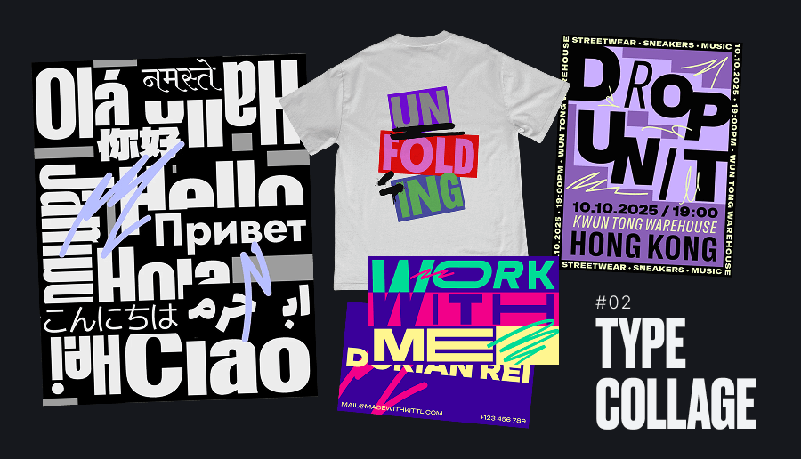
Collage blends images, shapes, textures, and type into one busy, expressive composition. Type collage, layering multiple fonts and sizes for pure visual energy, is especially popular in 2026 because it helps brands cut through crowded, oversaturated feeds.
Collage carries a raw, cut-and-paste authenticity that fits the year's anti-perfection mood. It's also a natural place to experiment with AI-generated fragments layered against handmade ones.
New graphic design trends breaking through in 2026
Now the fresh ones. These are the trends defining what "current" looks like this year.
Purposeful maximalism
Purposeful maximalism embraces bold colors, dense compositions, and expressive visuals while keeping a clear structure and hierarchy. Unlike chaotic excess, every pattern, texture, and typeface is intentional and works together to guide attention. It's maximalism with a plan.
Yes, we also said minimalism is here to stay. Both are true. 2026 is a split-screen year: some brands go quiet and confident, others go loud and layered. What they share is intent. The loud work still has to be readable.

Punk, grunge, and imperfect design
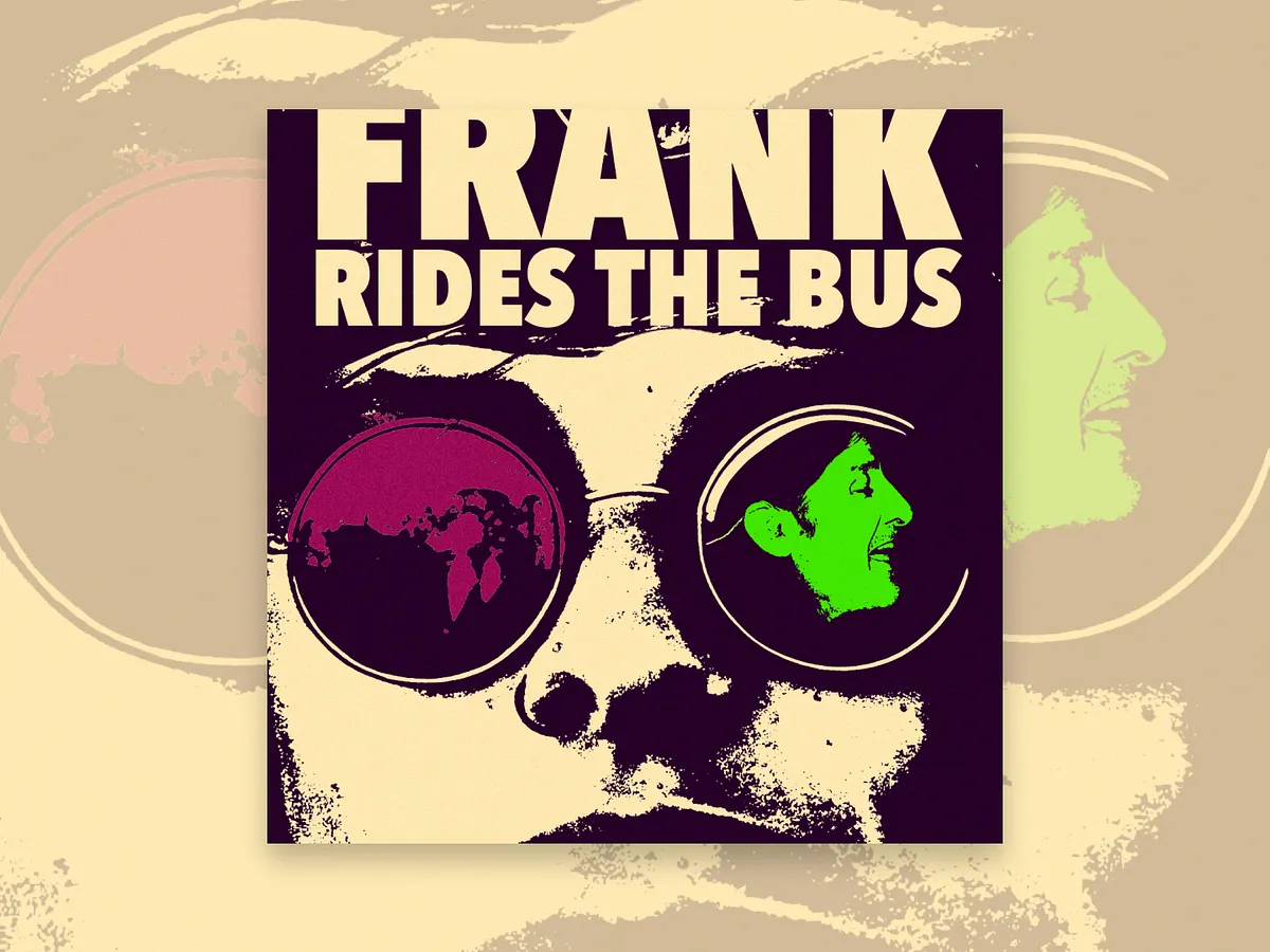
Punk and grunge design pushes back against AI polish with torn textures, hand-drawn elements, and rough, collage-style layouts. It feels raw and emotionally honest, tapping into a cultural craving for individuality and attitude over algorithmic smoothness.
This is the sharpest expression of the year's core theme. Where AI defaults to clean, grunge defaults to human fingerprints. It suits music, streetwear, and challenger brands that want to feel like they have a point of view.
Retro-future and nostalgic aesthetics
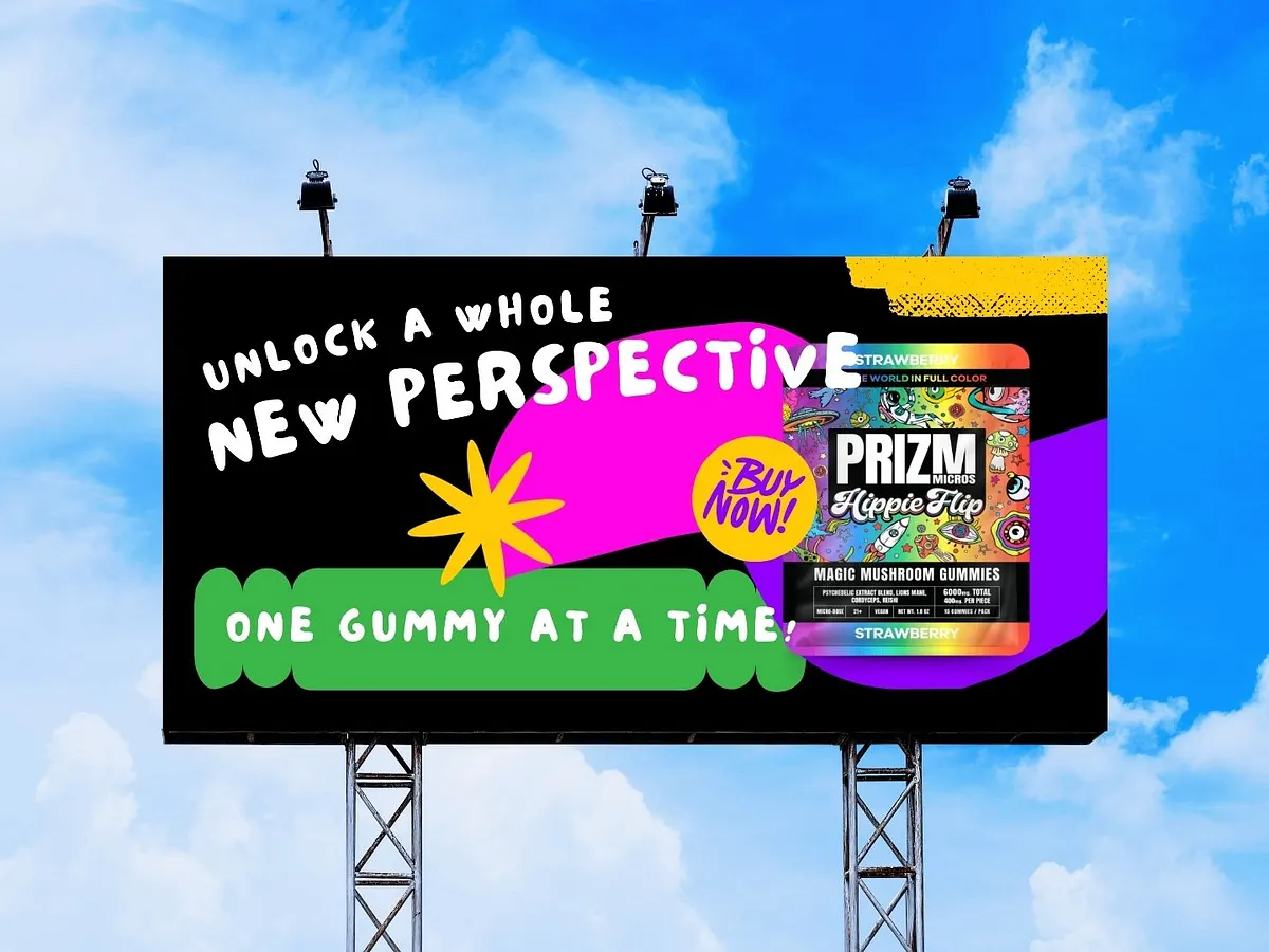
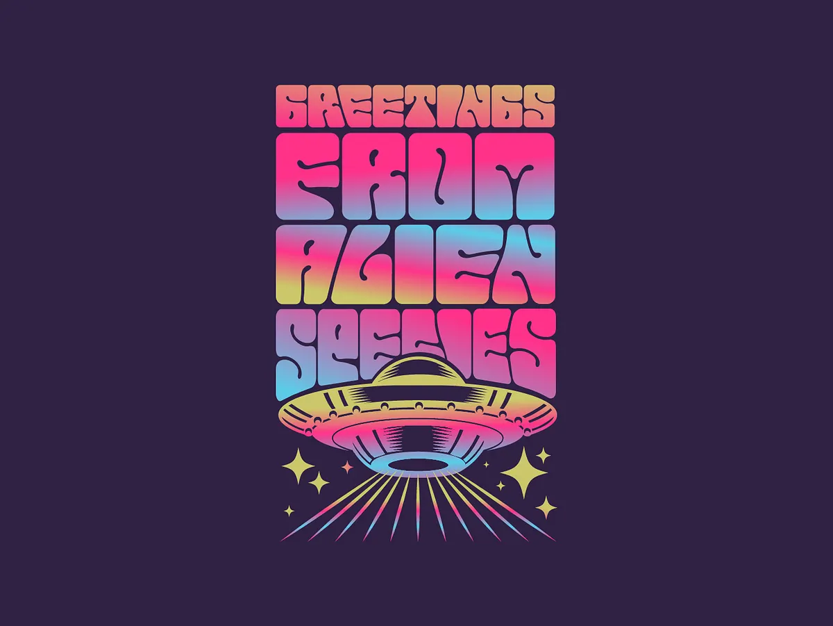
Retro-future design mixes nostalgia with futuristic energy: neon grids, Y2K textures, chrome finishes, and vintage tech motifs updated with modern polish. It connects emotionally by pairing familiarity with optimism, which is why tech, entertainment, and lifestyle brands lean on it.
It's a smart way to reach several generations at once. The nostalgia lands for millennials and Gen X, while the futuristic edge still feels fresh to Gen Z.
Soft-glow gradients and sensory visuals
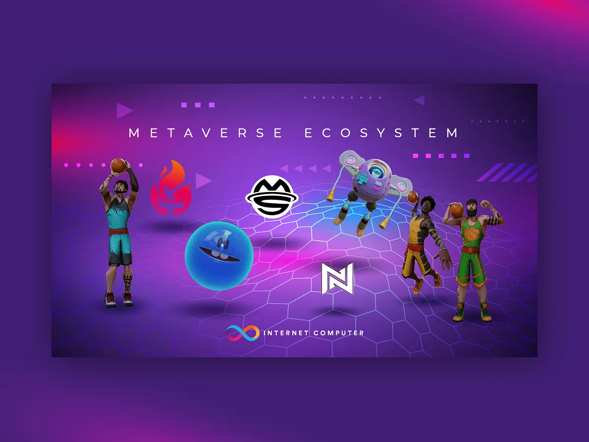
Soft-glow gradients replace flat color transitions with luminous, tactile light that suggests atmosphere and depth. Paired with layered textures and cinematic palettes, they make digital designs feel warm and emotionally engaging rather than clinical.
They're most at home on screens (websites, apps, social) though a skilled designer can translate the effect to print. Keep them subtle; overdone glow tips into early-2010s territory fast.
Kinetic typography
Kinetic typography is text that moves. With video dominating marketing and most social viewers watching on silent, animated type guides focus, tells a story, and adds personality without needing sound. It's one of the most in-demand digital design skills in 2026.
Even a small amount of motion on a headline changes how a post performs. When the sound is off by default, movement does the job the voiceover used to.

Motion branding
Motion branding extends a visual identity into movement: animated logos, explainer videos, and graphic systems designed to move from the start. As screens dominate every touchpoint, brands increasingly need identities that work in motion, not just static files.
If you don't already have an animated logo or a short branded animation, it's one of the higher-leverage things to invest in this year.

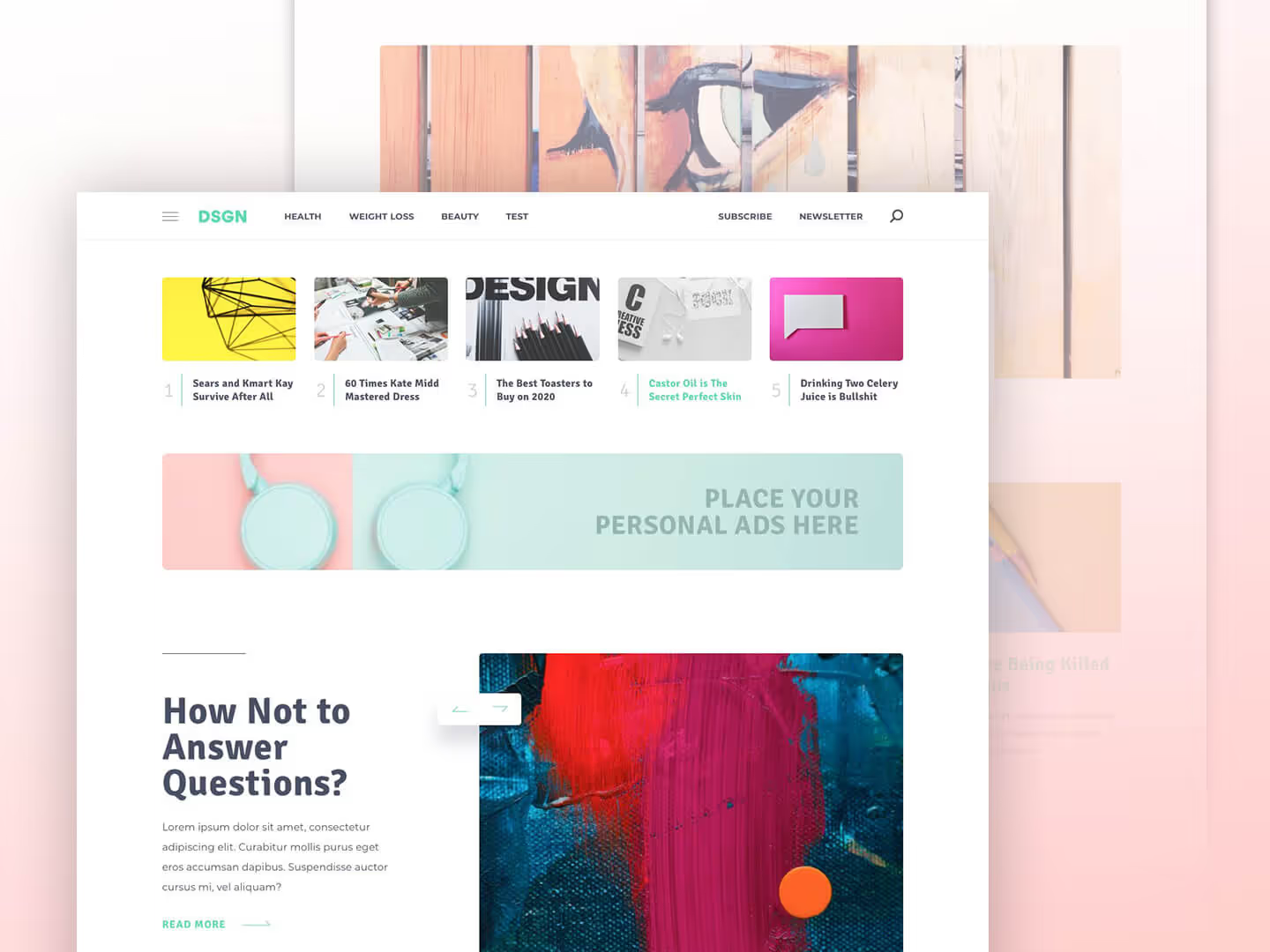
Bento grid layouts
Bento grids divide a layout into differently sized rectangular blocks, inspired by Japanese bento boxes. They organize content into clear sections without feeling rigid or monotonous, which makes them especially effective for websites and dashboards that need order across devices.
They've become a default for modern web design in 2026 because they're flexible, scannable, and responsive by nature. Product and SaaS sites use them constantly.
Inclusive, imperfect imagery
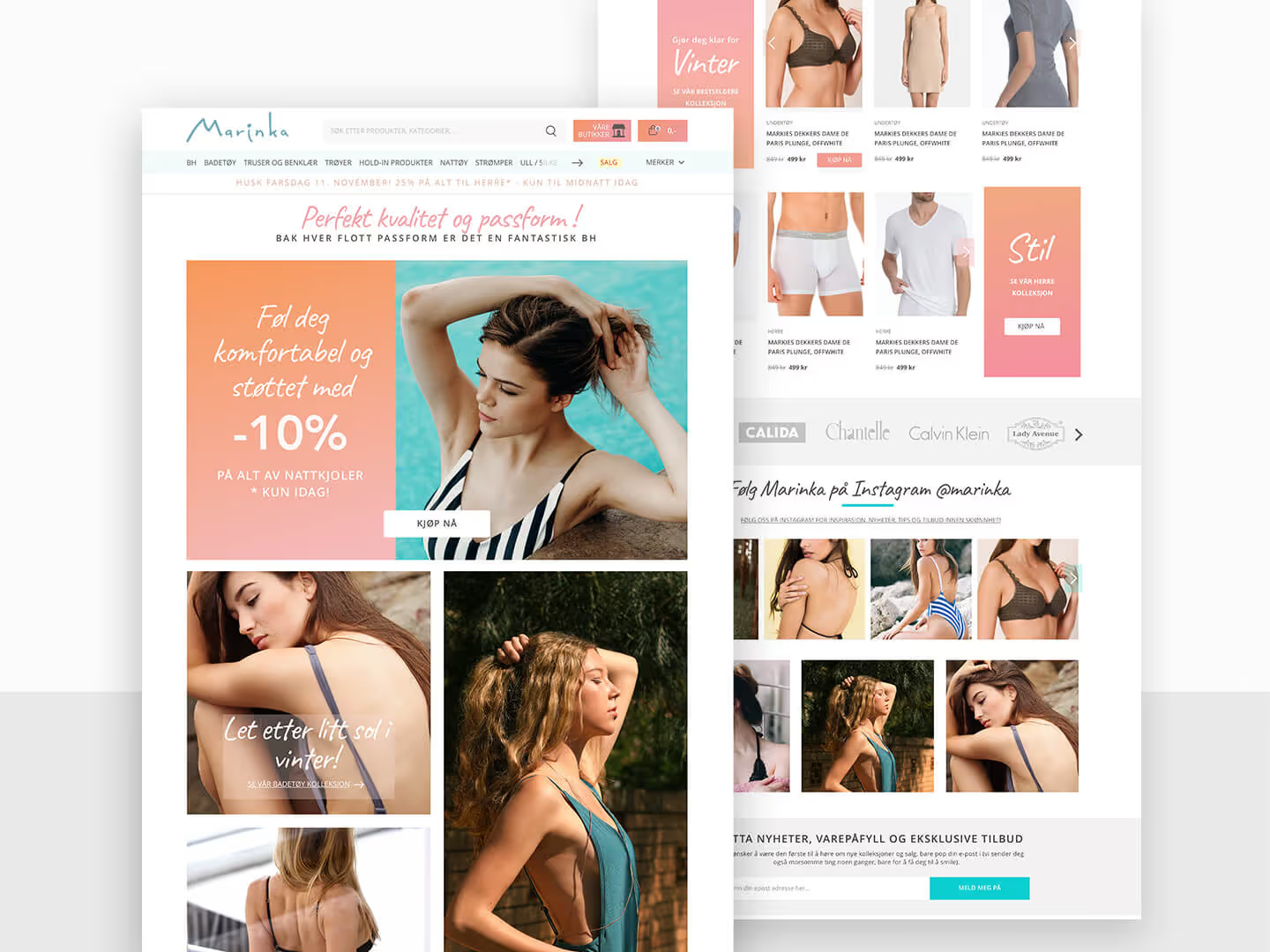
Inclusive, imperfect imagery favors real people and genuine settings over staged, flawless stock photos. Diverse subjects, natural moments, and slightly imperfect textures build trust and emotional connection, aligning design with broader cultural shifts toward authenticity and representation.
It's the photography version of the whole 2026 mood: audiences trust the image that looks real over the one that looks perfect.
Neo-brutalism
Neo-brutalism uses raw layouts, oversized typography, hard edges, and intentional friction to prioritize impact over polish. It feels confrontational and confident, which makes it a strong fit for brands that want to stand out through bold, unapologetic positioning.
It shares DNA with the punk and grunge revival but leans more digital and structural: think stark borders, clashing colors, and type that refuses to be quiet. Use it where standing out matters more than blending in.
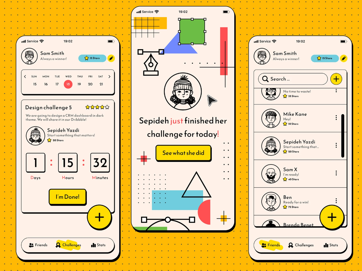
Glitch effects
Glitch effects use controlled digital distortion, smeared edges, scan lines, and visual noise, to suggest disruption, tension, or transition. In 2026 the effect is deliberate and often subtle, used as a strategic accent rather than blanket visual chaos.
A touch of glitch signals energy and edge, which is why it recurs in tech, gaming, and music branding. The key word is restraint: a little reads as intentional, a lot reads as a broken file.
How to use design trends without looking dated
The fastest way to look dated is to chase every trend at once. Trends are tools, and the point is to pick the few that fit your brand and use them with intent. Here's how to decide.
If your brand needs to feel trustworthy and premium, lean into bold minimalism, soft-glow gradients, and inclusive imagery. 👉 Quiet confidence beats novelty here.
If you're a challenger brand fighting for attention, punk and grunge, neo-brutalism, and purposeful maximalism will make you impossible to scroll past. ⚡ Just keep it readable.
If most of your work lives on social and video, prioritize kinetic typography, motion branding, and collage. 🎨 Movement and energy win in the feed.
If you want longevity over buzz, build on the durable trends (3D, hand-drawn illustration, strong data visualization) and treat the newer aesthetics as seasonal accents. The safest long-term move in 2026 is simple: whatever you make, let it feel human.
One thing that helps with all of this is a designer who already tracks these shifts so you don't have to. If you're outsourcing design, an on-demand graphic design partner can apply current trends across your logo, web, social, and illustrations while keeping everything on brand, for a flat monthly price with unlimited requests and revisions. That's the model ManyPixels runs, and it's a practical way to stay current without hiring for every skill a trend demands.
Frequently asked questions
The bottom line
If you remember one thing about graphic design trends in 2026, make it this: the winning move is to look human. ✅ Build on durable trends like 3D, bold minimalism, and hand-drawn illustration, then add newer aesthetics (grunge, maximalism, retro-future, motion) as accents that fit your brand. Chase everything and you'll look like everyone. Choose a few with intent and you'll look current for the right reasons.
Want a hand applying any of these? We've designed across every trend on this list. Explore ManyPixels plans and get current, on-brand design without hiring for each new skill.
{{GRAPHIC_BANNER="/dev/components"}}

Having lived and studied in London and Berlin, I'm back in native Serbia, working remotely and writing short stories and plays in my free time. With previous experience in the nonprofit sector, I'm currently writing about the universal language of good graphic design. I make mix CDs and my playlists are almost exclusively 1960s.

Top-quality designers
A complete creative team at your fingertips: graphic and web designers, illustrators, and more.

Lightning-fast turnaround
Get start today and receive your first update on the next business day.

All-inclusive pricing
Unlimited requests and revisions. One flat monthly fee. No surprises.

Flexible & scalable model
No contract. Scale up and down as needed. Pause or cancel at anytime.
Continue reading
Explore some of our best designs
Get inspired by a curated selection of ManyPixels work. Download the portfolio to see what our team can create.








