
15 Best YouTube thumbnail examples to learn from (2026)
TABLE OF CONTENTS

TL;DR
- ✅ Thumbnails with human faces get higher CTR, especially when the expression is exaggerated or makes direct eye contact with the viewer
- ✅ Curiosity gaps (burning questions, incomplete stats, dramatic before/after) drive clicks because viewers need to resolve the tension
- ✅ Keep text to 3-4 words max: your thumbnail needs to be readable at the size of a postage stamp on mobile
- ✅ Consistency across your channel builds recognition: viewers start clicking on visual style alone, before they read the title
- ✅ The best thumbnail types for your video depend on your niche: faces for personality channels, stats for data-heavy content, illustrations for education
- ✅ If you publish video content regularly, a graphic design subscription means you never have to make a thumbnail from scratch again
Introduction
No matter how good your video is, if the thumbnail doesn't stop the scroll, nobody's going to find out.
The perfect YouTube thumbnail needs to be custom rather than auto-generated through YouTube Studio. It needs to be high-resolution and use the right YouTube thumbnail size (1280 x 720 pixels). And it needs to match the style and purpose of your channel,, not just look pretty in isolation.
With those basics covered, the fastest way to level up your thumbnail game is to study what's working for creators in and outside your niche. Here are 15 real YouTube thumbnail examples, organized by type, with the design lessons behind each one.
The YouTuber thumbnail: utilize the power of human expression
Thumbnails showing the creator's face are among the most clicked on YouTube. Eye-tracking research consistently shows that direct eye contact in a thumbnail generates stronger engagement than thumbnails without faces. This type works best for personality-driven channels where viewers already recognize (or want to recognize) the person on screen. The key is pairing the face with something that adds context: bold text, a graphic element, or an expression that tells a story on its own.
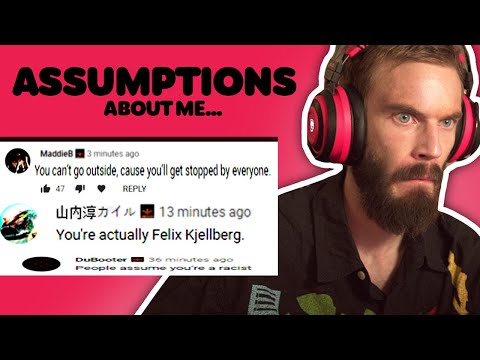
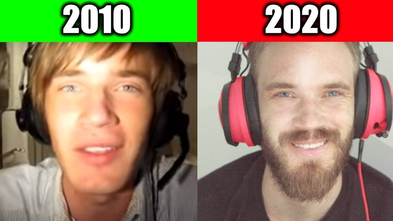
1. PewDiePie
PewDiePie's thumbnail strategy is built almost entirely on his face — whether he's pulling an exaggerated expression, staring into the camera, or reacting to something on screen. He's reached a point where a glimpse of his face alone is enough to earn a click from his audience. He also pairs face shots with bold YouTube fonts that heighten the emotional hook and prompt curiosity.
2. Neil Patel
Neil Patel's channel is a masterclass in personal branding through thumbnails. Almost every video uses the same photo of him, paired with minimal text on a clean background. The consistency is the strategy; his audience knows exactly whose content they're clicking on, and the simple layout signals professionalism and trust. If you're a knowledge creator, this is one of the most replicable thumbnail approaches on the platform.


3. James Charles
For beauty and makeup creators, showing your face is a given. But James Charles goes further by layering in emojis and simple graphic elements that make each thumbnail feel dynamic and unique. The result is a thumbnail that's recognizably "him" while still having variety. It's a good reminder that even a face-forward strategy benefits from a deliberate design layer on top.


Curiosity and how-to thumbnails
YouTube is one of the biggest search engines in the world, and a huge portion of viewers come looking for answers. Thumbnails that pose a question, tease an experience, or promise a specific insight tap directly into that intent. The best versions create a curiosity gap — they signal that the answer exists, but make the viewer click to get it. They work especially well for educational, finance, and lifestyle channels.
4. Katie Steckly
Katie Steckly's thumbnails are deliberately simple; usually just her, photographed in the same space where the video was filmed. What drives the click is the value proposition in the text: a common search query like "iPhone settings for filming" or a personal disclosure like how much she's made as a content creator. She lets the specificity of the promise do the heavy lifting, rather than complex design.


5. School of Life
School of Life covers psychology, philosophy, literature, and relationships; big, broad topics that need a sharp angle to make someone click. Their thumbnails do this with intriguing questions and the promise of a specific insight ("Why Intelligent People Struggle to Be Happy"). The thumbnails are visually minimal, which means the text has to work harder. If you have a content-heavy channel, this approach shows how much mileage you can get from the right question.


Quote thumbnails
A well-chosen quote can do everything a great thumbnail needs to do in one pass: create curiosity, signal the video's value, and give viewers a reason to stop scrolling. This format works particularly well for podcasts, interview channels, and motivational content, where the words themselves are the product. The quote should reveal something surprising or incomplete, which is enough to make the viewer want the full story.
6. Alpha Leaders
Alpha Leaders features talks from motivational speakers, so putting a poignant quote front and center in their thumbnails is the natural move. The best ones reveal something unexpected about a well-known figure, such as a counterintuitive belief, a little-known habit, a surprising admission. When the quote is specific and surprising enough, it does the job of a full thumbnail concept in five words or fewer.

7. Tony Robbins
Tony Robbins' channel uses a consistent format: his face, a bold quote overlay, and a simple background (often purple). It's a stripped-back approach, but the consistency is the brand. Viewers who recognize his style click based on trust, not curiosity. For creators building a personal brand in the coaching or speaking space, this kind of visual signature is worth developing early.


Before/after and transformation thumbnails
Before/after thumbnails work because they make a visual promise. You can see the result before you watch the video, and that result has to be compelling enough to earn the click. Home renovation, fitness, DIY projects, and product comparisons are all natural fits. The challenge is layout: a cluttered side-by-side can confuse rather than entice. The goal is to make the transformation immediately legible at thumbnail size.
8. Full Time Filmmaker
Full Time Filmmaker uses before/after thumbnails to compare filmmaking gear and DIY setups. Each thumbnail is high-resolution and communicates the comparison instantly - you can see both states at a glance without reading anything. The images are chosen specifically because the difference is dramatic and obvious, which is the foundation of a great transformation thumbnail.


9. DIY Wife
DIY Wife has some of the most thoughtfully laid-out before/after thumbnails on the platform. Rather than defaulting to a left-right split, she uses different layouts (including a smaller inset "after" image over the main "before") to create visual interest and avoid the cluttered look that plagues this format. If you're working with before/after content, her channel is worth studying for layout ideas alone.


Facts and stats thumbnails
Numbers stop the scroll. A bold stat in your thumbnail creates what designers call pattern interruption - your brain has to pause and process a figure like "$1,000,000" or "50 points, 40 rebounds" before it can move on. This format works especially well in finance, sports, history, and science channels where data is the hook, but it's underused across almost every other niche. If you're sharing a result, a case study, or anything that can be expressed as a number, this format is worth testing.
MrBeast has turned this into a core part of his visual brand. Thumbnails like "I Spent $1,000,000 On Lottery Tickets" or "Surviving 100 Days" lead with the number as the primary design element, making the scale of the stunt immediately legible before a single word of the title is read. The number does the emotional work; the face confirms who's doing it.
Versus and comparison thumbnails
The versus format works because it promises a verdict. Showing two things side by side sets up a tension that viewers want resolved, so they click to find out which one wins. This format is especially common in tech reviews, cooking, sports history, and any niche where audiences have strong preferences or tribal loyalties. The key is choosing comparisons where the viewer already has an opinion and wants to see if you agree.
Vox has mastered this format for educational content, including a well-known thumbnail comparing the rollercoasters of the 1800s to modern ones, where the contrast between the two images tells the whole story in a frame. You don't need to be a massive channel to use this format effectively. Two well-chosen images, a clear visual divider, and minimal text are all it takes.
Illustrated thumbnails that set you apart
Custom illustrations are one of the most effective ways to differentiate your thumbnails in a feed dominated by face shots and photos. A well-designed illustration signals effort and originality - it's not something you can throw together in a free thumbnail maker. It also gives you total creative control over color, composition, and style in a way that photography doesn't. This format is especially strong for educational, animated, and brand-forward channels that want a consistent visual identity without relying on the creator's face.
10. Canva
Canva's channel is a useful case study because they use illustration in multiple ways: from minimalist, professional-looking thumbnails for business audiences to colorful, playful designs for non-designers using their tool and its many features. Their thumbnails prove that there's no single "right" way to use illustration. The consistent thread is intentionality: every element serves a purpose, whether that's communicating professionalism, approachability, or creative energy. There's more than one way to use illustrated elements, and their channel offers plenty of youtube thumbnail examples to explore.

11. TED-Ed
TED-Ed is one of the clearest examples of illustration as a brand identity rather than just a design choice. Their thumbnails feature a range of illustration styles, from anatomical diagrams to painterly scenes to flat design icons, all tied together by a consistent quality standard and sense of visual storytelling. If you're building an educational channel and want thumbnails that feel considered and craft-forward, TED-Ed is the reference to study.

Real-life photography thumbnails
In a platform built for video, real-life photos still punch hard in thumbnail design. The catch is that a generic stock photo won't do anything for you. The photo needs to be striking, specific to your content, and consistent with your visual brand. The best photography thumbnails have a point of view: an unusual angle, a moment of genuine emotion, or a composition that makes you look twice.
12. The Bucket List Family
The Bucket List Family's channel documents one family traveling and working around the world, and their thumbnails lean into the genuine drama and beauty of that life. From anxiety-inducing angles to surprising close-ups, the photos feel real and specific, not polished or staged. That authenticity is exactly what makes them click-worthy. No template could replicate the feeling of a photo that was actually taken in that moment


13. XO, MaCenna
XO, MaCenna's DIY thumbnails look like a design catalog. The secret is simple: high-resolution photography, consistent lighting, and a clean color scheme that runs across the entire channel. When the photos are busy, she places text against a solid shape or single-color background so it stays readable. If you want to build a photography-based thumbnail style, her channel shows how much consistency matters. The individual photos aren't extraordinary, but together they create a channel that looks intentional and professional.


Product thumbnails
If you're using YouTube to promote or review a product, putting the product front and center in the thumbnail is almost always the right call. The challenge is avoiding a busy, cluttered frame: text overlays and colorful backgrounds can compete with the product rather than showcase it. The cleaner the composition, the more the product speaks for itself. This format works for physical goods, software, and digital tools.
14. Apple
Apple's YouTube thumbnails are exactly what you'd expect: minimal, high-contrast, and on-brand. Usually one accent color, a clean product shot, and nothing else. The restraint is the design. If you're promoting a physical product with strong visual design, Apple's approach is the benchmark; let the object do the work, and give it room to breathe.


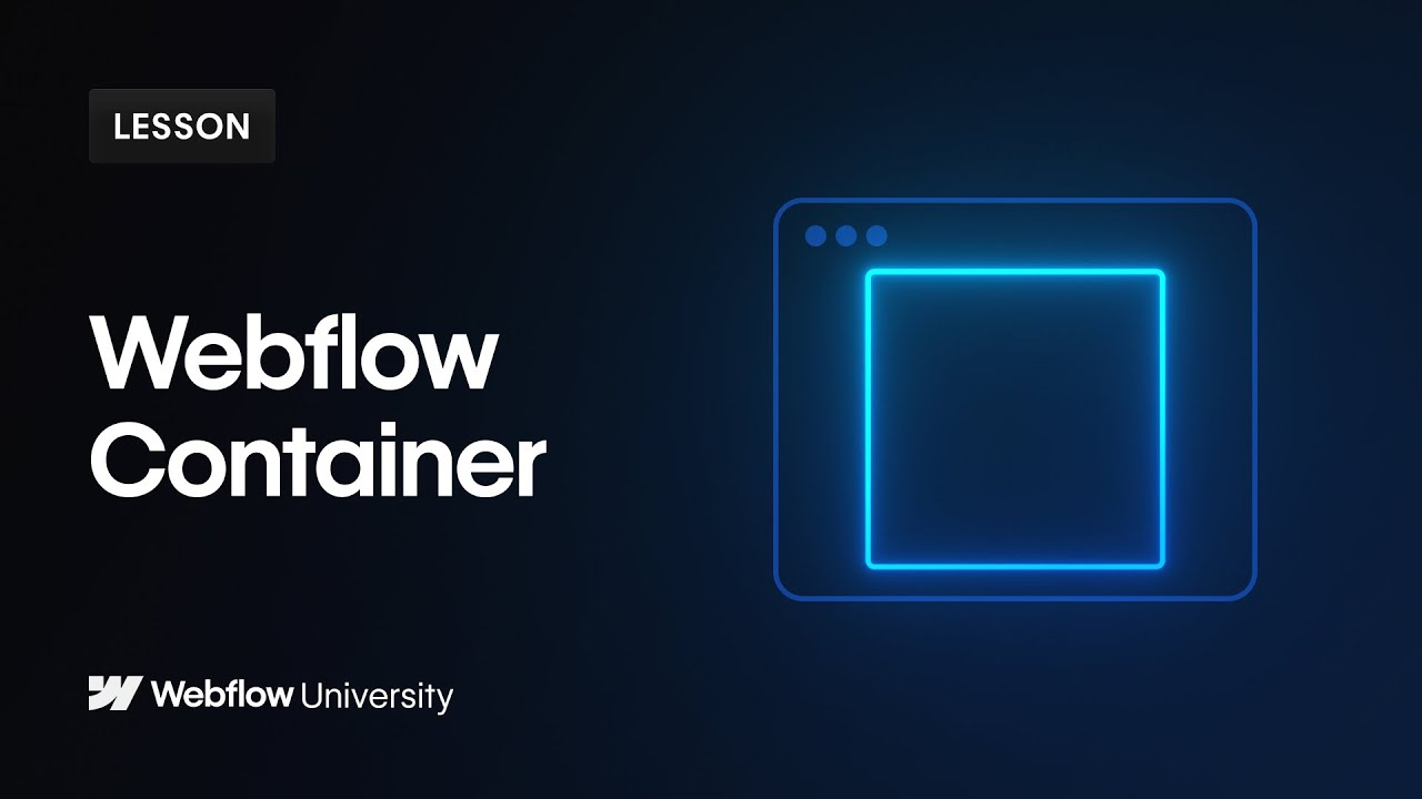
15. Webflow
Digital products are harder to photograph than physical ones, but Webflow has built a thumbnail style that makes software look visually compelling. They use a consistent dark blue palette with gradients and contrasting accent colors to add depth. The text is the primary focus and the visual elements support rather than compete. It's a good template for any SaaS or digital product channel: commit to a color system, let the text lead, and keep everything else in service of it.

YouTube thumbnail best practices
Great YouTube thumbnail examples give you the "what." These fundamentals give you the "how" to apply the same principles to your own content.
One rule that applies to every format: don't design thumbnails at full resolution only. Shrink your design to 200px wide before finalizing it. If the key visual or text disappears at that size, the thumbnail won't work for most of the people who see it.
If you're producing video content regularly and want to stop making thumbnails from scratch each time, a graphic design subscription covers custom thumbnails as part of its scope. You can also work with a graphic design service for YouTube creators to build a reusable template system that keeps your channel looking consistent without starting over every upload.
Frequently asked questions
Can I get professional YouTube thumbnails made for me?
Yes. A graphic design subscription like ManyPixels covers YouTube thumbnails as part of its scope. You can submit thumbnail requests alongside your other design work without paying per design. Plans start at $699/month and include unlimited requests and revisions.
We hope these YouTube thumbnail examples have given you a clear picture of what works and why. Whether you take one format and run with it or mix approaches across your content, the principles are consistent: simplicity, contrast, a clear hook, and consistency over time.
If creating custom thumbnails for every upload is slowing you down, explore ManyPixels plans and see how a design subscription can keep your channel looking sharp without the time investment.

Having lived and studied in London and Berlin, I'm back in native Serbia, working remotely and writing short stories and plays in my free time. With previous experience in the nonprofit sector, I'm currently writing about the universal language of good graphic design. I make mix CDs and my playlists are almost exclusively 1960s.

Top-quality designers
A complete creative team at your fingertips: graphic and web designers, illustrators, and more.

Lightning-fast turnaround
Get start today and receive your first update on the next business day.

All-inclusive pricing
Unlimited requests and revisions. One flat monthly fee. No surprises.

Flexible & scalable model
No contract. Scale up and down as needed. Pause or cancel at anytime.
Continue reading


Explore some of our best designs
Get inspired by a curated selection of ManyPixels work. Download the portfolio to see what our team can create.








