

20 Bakery logo ideas: designs, colors & examples

TABLE OF CONTENTS

TL;DR
- ✅ A strong bakery logo is simple, memorable, scalable, and instantly reads as "bakery," usually through a wordmark paired with a baking symbol.
- 🎨Colors split into two families: savory palettes (warm reds, oranges, browns) for bread and artisan shops, and sweet palettes (pinks, purples, pastels) for cakes and patisseries.
- 🌾 The most common symbols are wheat, a rolling pin, a whisk, a croissant, a cupcake, or a friendly mascot.
- 🗛 Cozy bakeries lean on script, serif, and handwritten fonts; modern shops go bold and clean.
- 👉 Need one made for you? ManyPixels designs custom bakery logos and full brand kits from $699/month, with unlimited requests and revisions.
A bakery logo is the visual mark that identifies a bakery, cake shop, or patisserie, usually built from a wordmark plus a baking symbol such as wheat, a rolling pin, or a mascot. A good one tells customers what you sell and how you sell it (rustic and traditional, or sweet and playful) before they taste a single crumb.
If you own a bakery and need a brand identity as delightful as your pastries, this guide is your starting point. Below are 20 real bakery logos from designers around the world, grouped by the idea behind them, plus practical tips on the colors, fonts, and icons that make bakery branding work.
What makes a good bakery logo?
A good bakery logo is simple enough to recognize at a glance, memorable enough to stick, scalable enough to work on a paper bag and a storefront sign, and relevant to the kind of baking you do. Most successful bakery logos combine a clear name with one baking cue, rather than crowding several symbols together.
When you review the examples below, notice how each one commits to a single idea: one symbol, one mood, one color story. That restraint is what separates a logo that reads instantly from one that feels busy. For more on the building blocks, see our guide to the different types of logos.
Bakery logo colors: savory vs. sweet palettes
Bakery logo colors usually fall into two families. Savory palettes use warm reds, oranges, browns, and golds to evoke fresh bread, wood-fired ovens, and artisan tradition. Sweet palettes use cooler pinks, purples, and pastel blues to signal cakes, cupcakes, and desserts. Pick the family that matches what customers actually walk in to buy.
Whichever direction you choose, keep the palette tight (two or three colors) so the logo stays legible when it shrinks. If you want help pairing shades, our guides to logo color combinations and logo color palettes break it down.
Fonts and icons for bakery logos
The best fonts for a bakery logo depend on the mood you want. Script, serif, and handwritten fonts create a cozy, homemade, or elegant feel, which is why so many bakeries use them. Bold or modern sans serifs work when you want to stand out and look contemporary. Whatever you pick, test it for readability at small sizes first.
For the icon, most bakeries reach for a literal cue: wheat, a loaf, a rolling pin, a whisk, a croissant, or a cupcake. Others use a mascot for personality. Keep the symbol simple so it survives on everything from a stamp to a shopfront. See our roundup of the best fonts for logos to narrow it down.
Wheat and grain bakery logos
Wheat and grain motifs are the most recognizable bakery symbol because they instantly signal fresh baking, from bread to pastries. Golden wheat strands show up on both bakery packaging and logos, and they pair well with warm, savory palettes.
1. Mousiou Bakeries
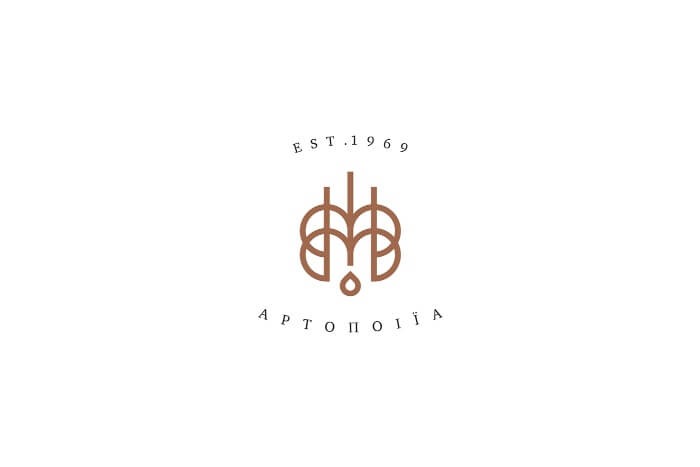
This simple bakery logo has many layers: a single strand of wheat in the middle, a drop of water, and the letter M, for the surname of the bakers and owners, Mousiou.
2. Louise Boulangerie et Pâtisserie
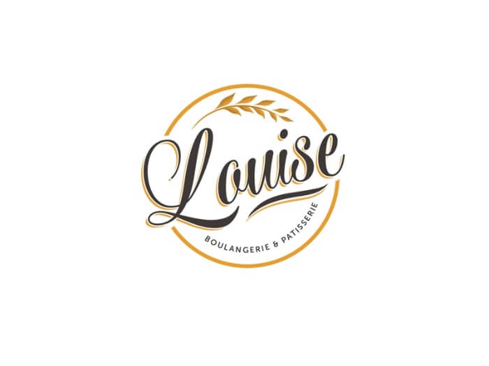
This french pastry and sweets shop logo uses a playful and feminine script font in which the name of the baker and eponymous shop is written, and a tasteful combination of gold and black.
3. No. 10 Bakery
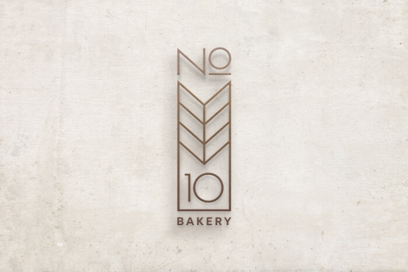
No. 10 is a more modern and minimalistic approach to a bakery logo. The wheat strand and brand name are incorporated into a two-dimensional, Art Deco style frame, with a muted gold color.
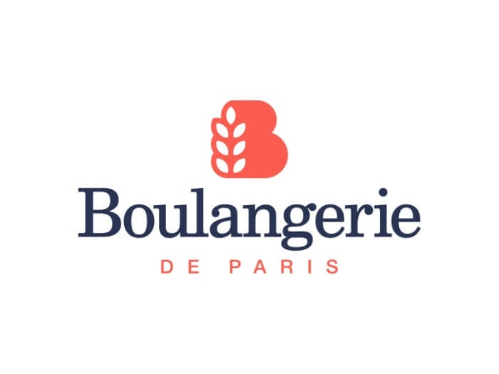
4. Boulangerie de Paris
This traditional bakeshop logo has a unique color palette, using a coral pink and navy blue theme. The logo is created by combining the letter B and a wheat strand.
Bakery logos inspired by local or cultural cuisine
Bakery logos often nod to the culinary tradition behind the shop, which is a smart way to stand out in a crowded market. A cultural symbol, local color, or national motif can tell your story in a single mark. Here are four that lean into where the baking comes from.
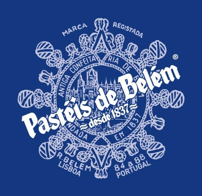
5. Pastéis de Belém
If you've ever been to Lisbon, you must have heard about the Belem Pastry Shop and their pastel de nata. The logo is in the signature blue and white colors often used in Portuguese ornaments and tiles, and the rope pattern reminds us of maritime history.
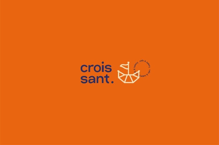
6. Croissant Café & Bakery
This business sells croissants by a lake, so they used the crescent shape of the croissant to symbolize a boat. It's a modern bakery logo with a great concept.
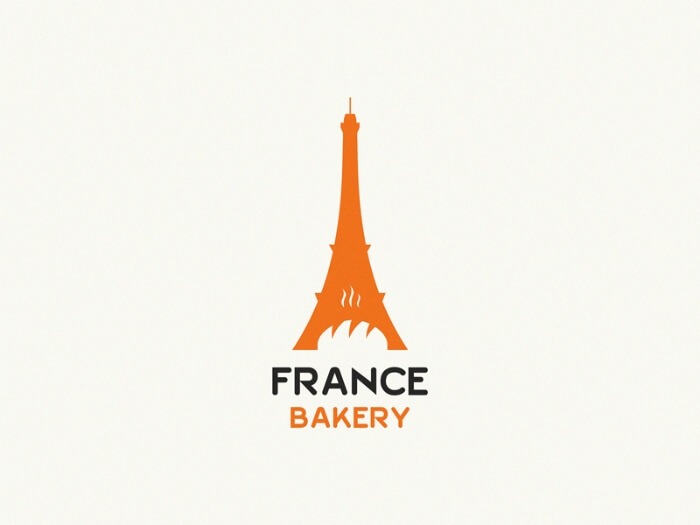
7. France Bakery
This Eiffel tower and bread logo successfully uses the negative space in the most famous symbol of the French capital.
8. Amai Bakery
Amai Bakery logo blends traditional Japanese architecture with the lettermark, making a unique and elegant brand logo.

Rolling pin and whisk logos
A business logo often features the tool of the trade, and for a bakery nothing is more instantly readable than a rolling pin or a whisk. These tool-based marks work especially well as emblem logos, where the icon sits inside a badge or frame. Here are four that do it well.
9. Merit Art Bake
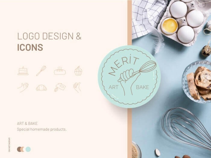
A triumphantly elevated whisk in the baker's hand, and a lovely color palette, make this a cute emblem logo. The graphic designer provided additional icons for use on the bakery website and social media marketing.
10. São Matheus Doces e Experiências
This emblem logo depicts the "weapon of choice" of both the baker and the person who'll enjoy their products.
11. The Baker Chef
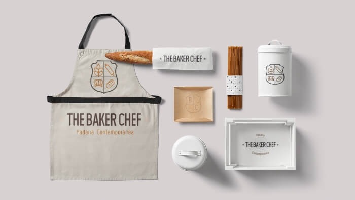
The designer behind this bakeshop logo created an emblem with a chef's hat, a rolling pin, a strand of wheat and bread. Although the concept is traditional, the minimalist icon design ensures this logo can stay relevant for a long time.
12. Amare
The two versions of this design both feature a casual font, and a warm yellow color, perfect for the food industry.
Wordmark logos built from the bakery name
A wordmark logo turns the bakery name itself into the design, often by hiding a baked good inside a letter. It works best when your name is short and distinctive, and it keeps things clean whether it lands on a business flyer or the header of your bakery website. These five make the name do the heavy lifting.
13. Bagel O Bagel
This brilliant logo for a bagel and coffee shop features the company's main products, in a cute modern style.
14. Cabinet
The Cabinet Bakery used the look of their interior as the logo. It evokes a cozy atmosphere with a small library, pastries, and a cup of coffee placed in a message bubble.
15. Yum Yum
In this cool design, the business name serves as the frosting on a very appetizing cupcake. Cute, fun, and full of taste: isn't that what cupcakes are too?
16. Bazar
Bazar has a classy sans serif inscription of the name of the cafe and a flipped B that looks like two pastries next to each other.
17. Chez Nana
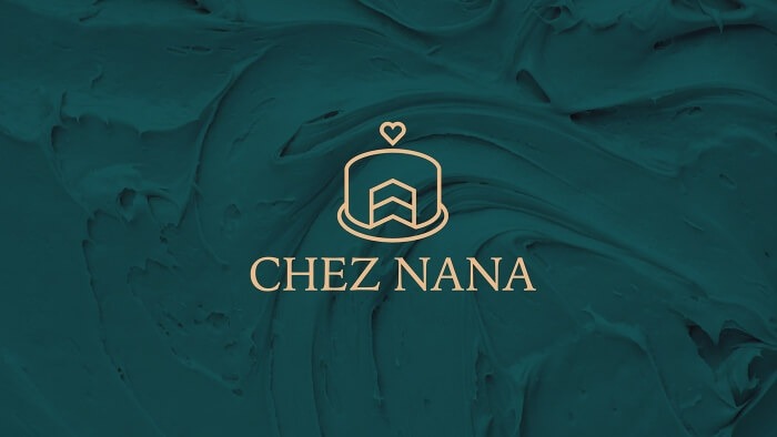
This cute logo combines a cake, a house and a heart, symbolizing love. It shares the message that we often associate cakes with important days and occasions (weddings, birthdays, and so on).
Mascot and character bakery logos
A mascot logo gives your bakery a face and a personality, so customers picture a friendly character when they think of your brand. It is a warm, approachable choice that suits family-run and artisan shops especially well. Here are three mascots that pull it off.
18. Dona Vilma
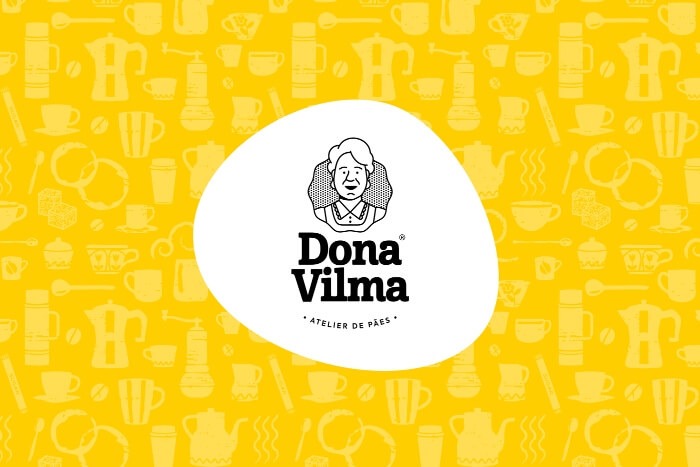
Dona Vilma, the baker in charge of making artisan bread and sandwiches, is also the mascot of this business. It is a simple depiction in a monochrome, cute logo, and a friendly serif font.
19. Mi Tlali Dessertery
The combination of a sans serif and an elegant script font, a welcoming and warm palette, and the cute character make this a great logo for a pastry and dessert shop.
20. Pavlin Bakery
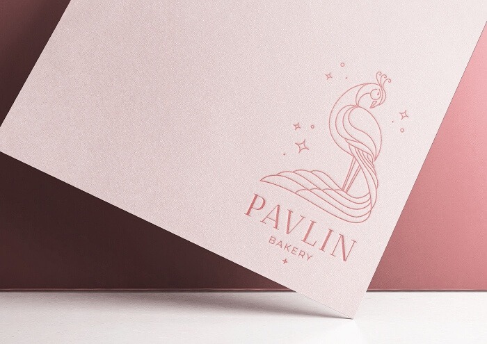
Pavlin Bakery used a peacock for its mascot. A great choice since cakes and desserts are often as elegant and beautiful as this majestic bird.
Cute bakery logo ideas
Cute bakery logos win customers over with soft colors, rounded fonts, and a playful icon or character. If a friendly, welcoming vibe is what you want, look at Yum Yum (a name that becomes cupcake frosting), Chez Nana (a cake, house, and heart combined), Bagel O Bagel (bagels in a bright modern style), and Mi Tlali Dessertery (a warm palette with a sweet character). The common thread is warmth over polish: gentle curves, cheerful color, and one charming detail.
Famous bakery logos to learn from
Famous bakery logos show how far a simple, consistent mark can travel. The best-known chains keep their branding clean and repeatable so it works on a storefront, a box, and a phone screen alike. A few worth studying:
- Cinnabon: a warm, swirling wordmark that echoes the product itself.
- Krispy Kreme: a retro bowtie-style banner with vintage red-and-green color.
- Nothing Bundt Cakes: a friendly script that leans into homemade charm.
- Milk Bar: a stripped-back, modern wordmark with playful personality.
- Levain Bakery: an arched wordmark paired with a hand-drawn cookie.
Get a custom bakery logo with ManyPixels
Finding ideas is one thing. Turning them into a finished logo is another. Even a small local bakery needs a memorable brand to attract customers and stand out, and your logo is the foundation of that identity.
Hiring a freelancer, an experienced logo designer can charge upwards of $500 for a single logo, and several thousand dollars for a full brand identity. ManyPixels is a more predictable route: our designers create your bakery logo plus everything around it, from a brand guide to packaging, social media graphics, and ads
Frequently asked questions
Get your bakery logo with ManyPixels!
If your bakery needs a brand refresh, a design subscription is the best and most affordable way to get all the designs you need. You’ll often end up paying less than hiring freelancers, and avoid unpredictable timelines and availability. You can see how unlimited design services compare to freelancers here.
ManyPixels has completed over 150k designs for over 2,000 happy clients worldwide. We have a rigorous quality control process and a small, select team of designers.
Explore pricing plans or get in touch to learn more.

Journalist turned content writer. Based in North Macedonia, aiming to be a digital nomad. Always loved to write, and found my perfect job writing about graphic design, art and creativity. A self-proclaimed film connoisseur, cook and nerd in disguise.

Top-quality designers
A complete creative team at your fingertips: graphic and web designers, illustrators, and more.

Lightning-fast turnaround
Get start today and receive your first update on the next business day.

All-inclusive pricing
Unlimited requests and revisions. One flat monthly fee. No surprises.

Flexible & scalable model
No contract. Scale up and down as needed. Pause or cancel at anytime.
Continue reading

Explore some of our best designs
Get inspired by a curated selection of ManyPixels work. Download the portfolio to see what our team can create.







