
Instagram colors: build the perfect palette (2026)
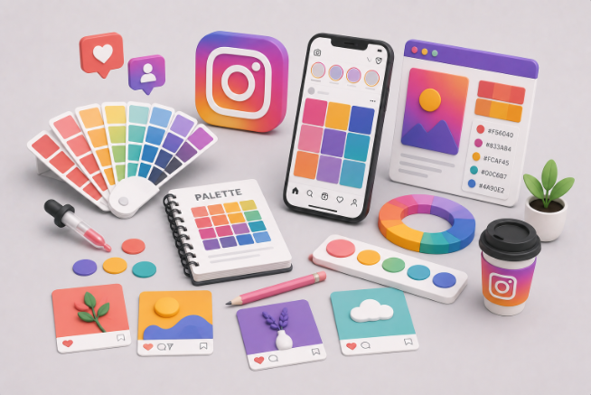
TABLE OF CONTENTS

TL;DR
- An Instagram color palette is a small, repeatable set of four to six brand colors used across your posts, stories, and highlights so your feed looks cohesive.
- Start from your existing brand color, then build out with the color wheel (monochromatic, analogous, complementary, triadic, or neutral-plus).
- Lock your palette to actual hex codes so every designer, tool, and template stays on-brand. We share ready-to-use codes below.
- Color is only half the job: how you arrange posts in the grid decides whether the feed reads as one story.
Instagram crossed 3 billion monthly active users in 2025, and it is still one of the most visual, most competitive marketing channels a business can be on. When someone lands on your profile, the colors register before a single caption does.
That first impression is why consistency pays off. Marq (formerly Lucidpress) found that consistent brand presentation can lift revenue by up to 33%, and a defined palette is one of the simplest ways to get there. So before you set up a professional-looking Instagram account, it is worth being intentional about your colors rather than grabbing whatever a random generator spits out.
Here is how to choose, code, and use your Instagram colors, step by step.
What is an Instagram color palette?
An Instagram color palette is a small, repeatable set of brand colors, usually four to six, that you use across posts, stories, and highlights so your feed looks cohesive and instantly recognizable. A practical mix is one light neutral, one dark anchor, one main brand color, and one or two accents for stickers, text, or highlights.
The palette does two jobs at once. It guides which photos and graphics you post, and it keeps the whole feed from looking like a random pile of images. When the colors repeat, your profile reads as one brand instead of a scrapbook, and that is what makes a consistent color scheme worth the effort.
Include your brand color first
The single most reliable palette decision is to build around the color you already own. If people connect a color to your logo or website, carrying it onto Instagram means someone who clicks over from another channel immediately knows they are in the right place.
It is tempting to think loud, unexpected color combinations are the only way to get noticed on a saturated platform. Getting noticed is only step one, though. You want people to remember and trust your brand, so if your identity is calm, corporate, or a little conservative, a neon palette might win attention and lose the sale. Your brand color palette should lead, and Instagram should follow it.
Find good color pairings using color theory
To add colors that pair well with your main one, use the color wheel. Complementary colors sit on opposite sides of the wheel, analogous colors sit side by side, and the relationships between them are the basis of every scheme below. If the terms are fuzzy, our guide to what color theory is breaks down the fundamentals.
Here are the palette types worth knowing, each with a brand that pulls it off.
Monochromatic
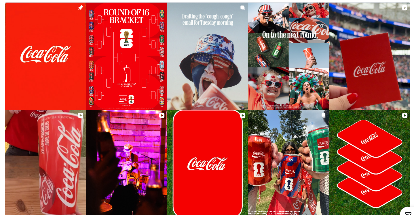
A monochromatic scheme uses one color in several shades and tints. It is the easiest palette to start with and the easiest to keep consistent. If your brand is tied strongly to a single color, like Coca-Cola and red, monochrome keeps brand recognition high. Black and white counts too, and done well it looks genuinely sophisticated.
Analogous
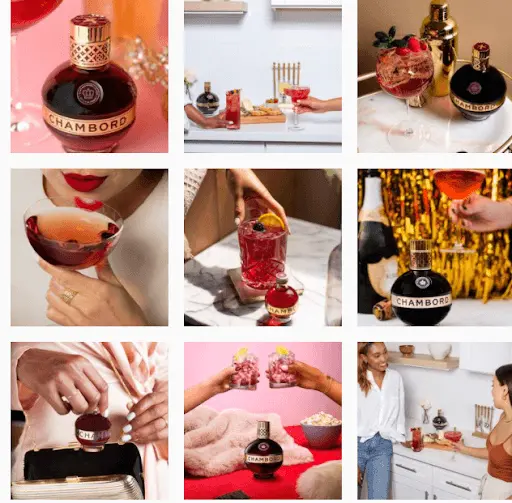
Analogous palettes use colors that sit next to each other on the wheel, like red, orange, and pink. They feel harmonious while still giving you room to experiment. Chambord centers its feed on the deep burgundy of its signature bottle and works in red, pink, and purple across different shots, which builds brand awareness without every post looking identical.
Complementary
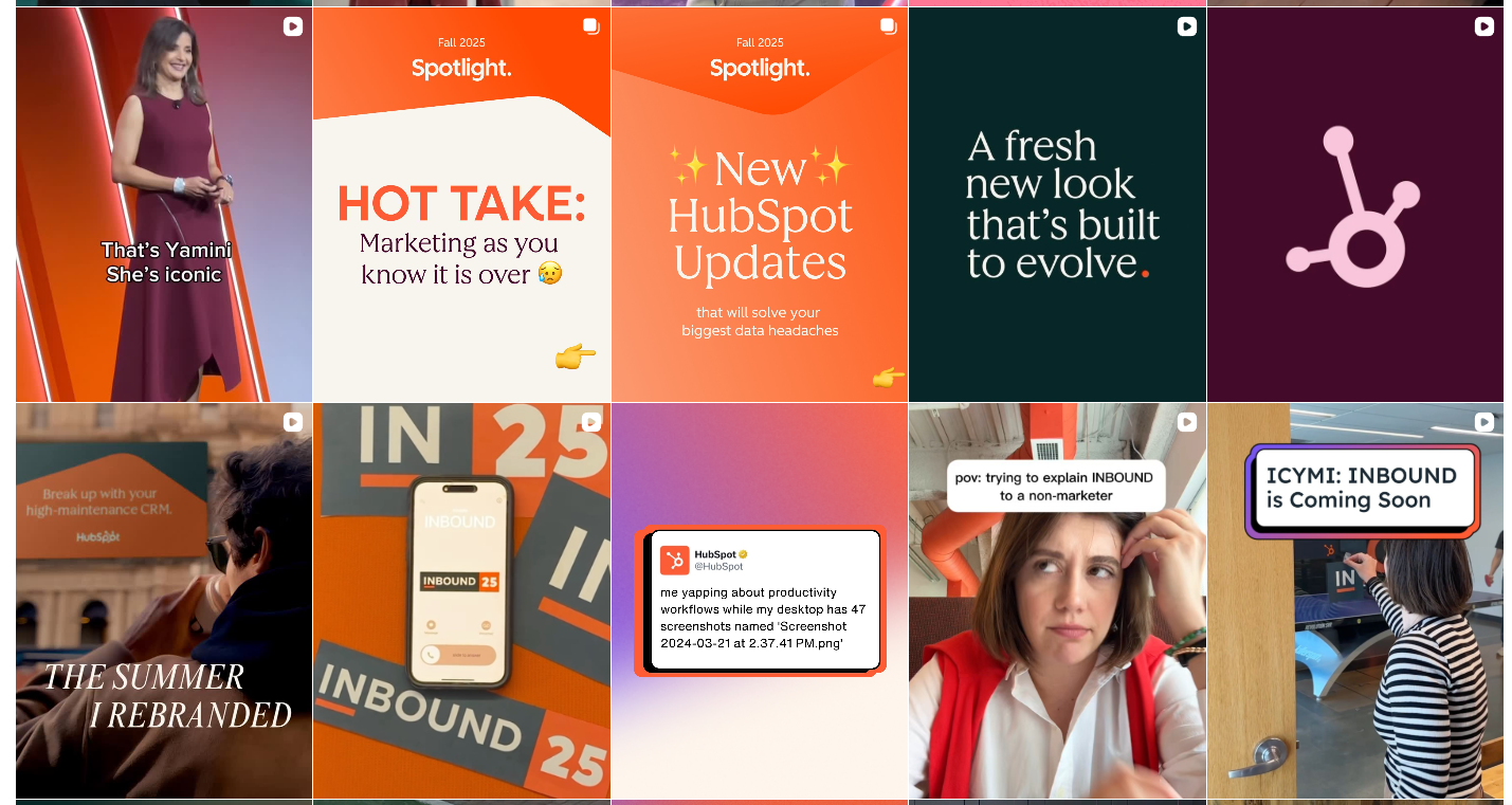
Complementary (or contrasting) palettes pair colors from opposite sides of the wheel. They are eye-catching and hit harder, which is great when you want to look innovative and energetic. HubSpot is known for its coral, and on Instagram it often pairs that coral with navy. A good ratio to keep it from clashing is 60% of one color, 30% of the opposite, and 10% neutral.
Triadic
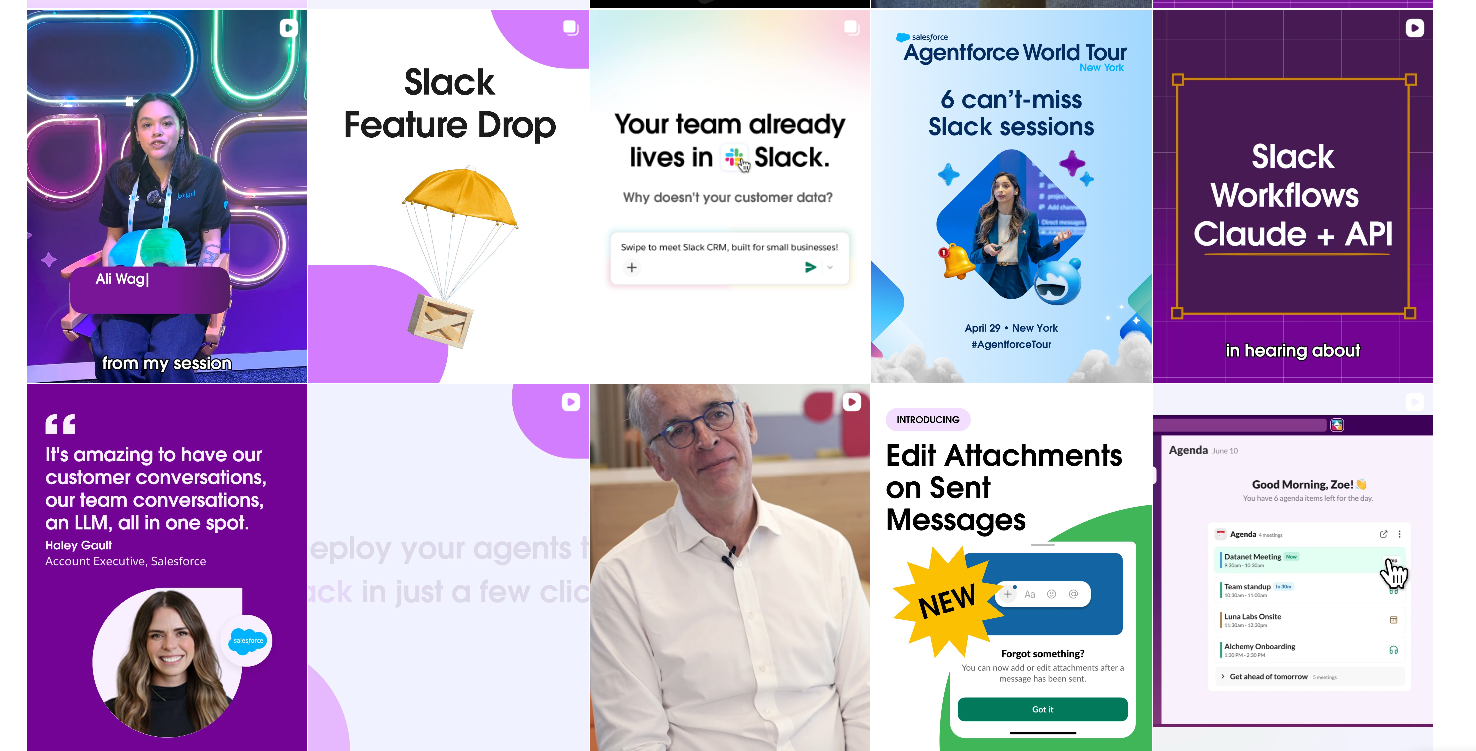
A triadic palette uses three colors spaced evenly around the wheel. It is the trickiest to pull off and can tip into loud fast. Slack manages it with purple, blue, and yellow, which works because those colors also live in its logo, so the vibrant scheme still feels on-brand.
Neutral and neutral-plus
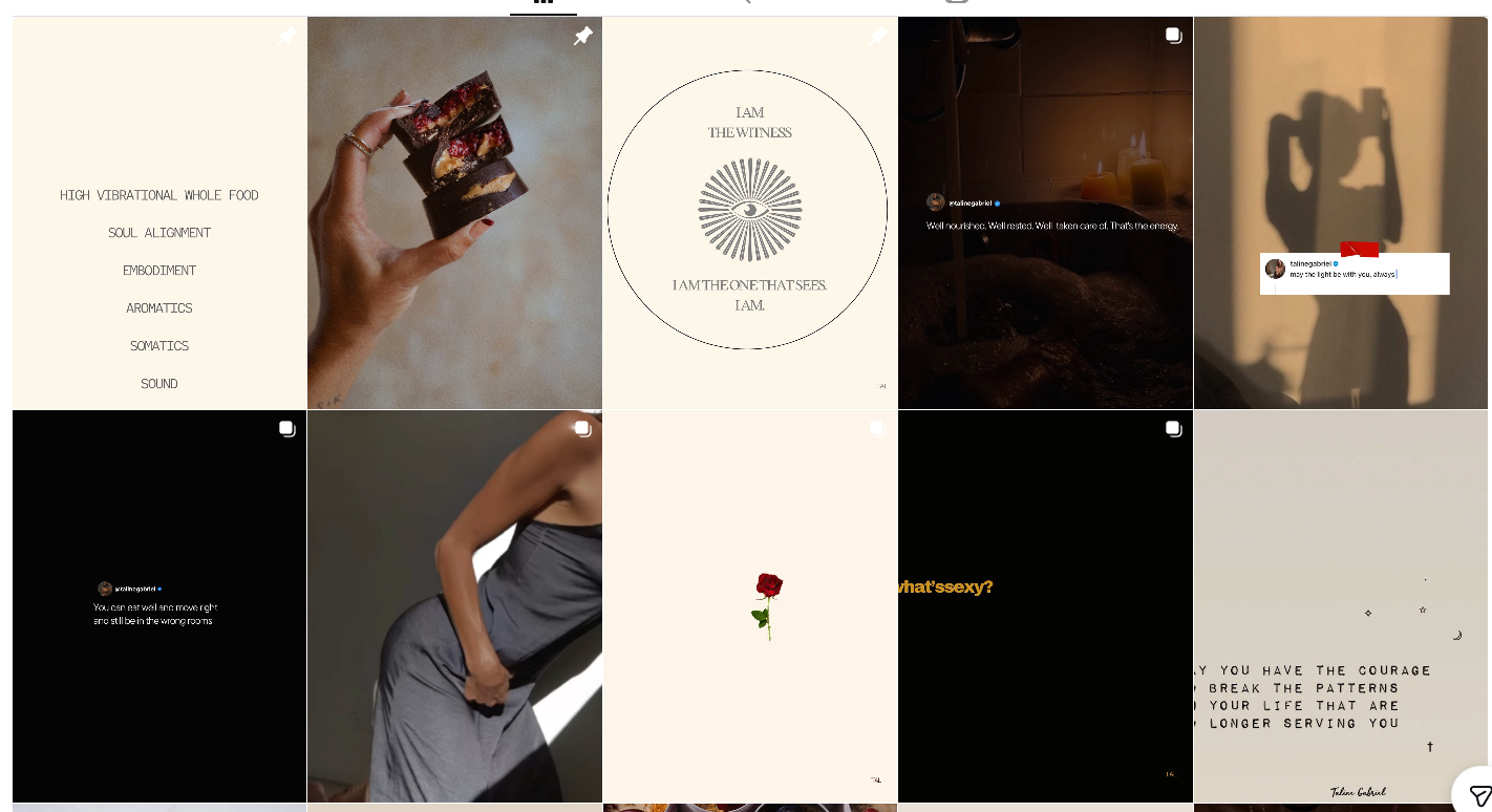
Neutral palettes lean on earthy, muted tones, and neutral-plus adds a single non-neutral color for contrast. This is one of the most popular looks on Instagram right now thanks to the ongoing natural, understated trend. Keep the color pop small: the lower the percentage, the more attention it grabs.
Content creator/author Taline Gabriel uses lovely, soothing tones which match her personal brand promoting healthy eating and a holistic approach to personal wellbeing.
Instagram colors and hex codes
Once you have picked a direction, lock it to actual hex codes. Hex values are what keep a palette identical across Canva, your design tool, and every template, so nothing drifts over time. The table below gives ready-to-use starting points for the most common feed styles.
If you specifically need the Instagram brand colors (the logo gradient itself), the official values run purple #833AB4, pink #C13584, rose #E1306C, orange #F77737, and gold #FCAF45, with #405DE6 and #5851DB anchoring the blue end. These have been consistent since 2016, so they are safe to use when you are designing something that references the platform directly.
Instagram grid and feed layout ideas
Colors decide the mood, but the grid decides whether the feed reads as one story. A layout is the pattern you follow when placing posts in your nine-square grid, and choosing one before you post is what stops a feed from looking cluttered. The most useful patterns are checkerboard, rows, puzzle, and color-block.
A checkerboard alternates two post types, like a quote tile then a photo, so a signature color pops in every other square. A row layout keeps each horizontal line of three visually related, which works well for tutorials or product ranges. A puzzle grid treats several squares as one large image, which is striking but demands planning. A color-block feed moves through color families gradually, so the palette flows top to bottom.
Whichever you choose, plan a few posts ahead in a preview tool so you can see how a new square lands before it goes live. For more inspiration on tying color and layout together, see our roundup of the best Instagram themes.
Instagram color theme ideas by color
If you would rather start from a vibe than a color-theory rule, pick a single dominant color and let it lead the feed. The trick is to repeat that color in most (not all) of your photos: in backgrounds, props, outfits, or graphics. A few themes that consistently work:
- White: clean, minimal, easy to keep consistent with bright backgrounds.
- Blue: calm and trustworthy; pull it from skies, water, and quote tiles.
- Green: the simplest natural theme, plants do most of the work.
- Pastel: soft and approachable, ideal for shops and creatives.
- Earthy neutral: beige, brown, and sage for a warm, understated look.
- Black: bold and sophisticated; add white elements for contrast.
Themes are a starting point, not a cage. Once you can hold a color consistently, you can layer in the color-theory schemes above to make it more deliberate.
Make your photos consistent
Matching graphics is easy. Matching photos takes a bit more work, because you rarely shoot everything in the same conditions. Two reliable fixes are adding a subtle color overlay (like a light filter) so every image leans toward your palette, and arranging posts so colors balance across the grid rather than clustering.
In our experience running ManyPixels' own social channels, a duotone effect is the fastest way to make mixed stock photos feel like one set. It maps the image to two brand colors, so even unrelated source photos come out cohesive in a couple of minutes.
Focus on a theme
A business profile is more than a stream of individual posts; it is a place people go to understand your company, so the whole feed should tell one story. Beyond the palette, think about the mood you want each shot to carry. Yankee Candle rarely posts outdoor scenes even though people use candles everywhere, because every image is built to evoke the same cozy, indoor warmth. That consistency of feeling is as important as consistency of color.
Switch things up gradually
Consistent Instagram colors do not lock you into one look forever. Plenty of brands shift their palette for a season or a campaign. The key is to do it gradually: change several posts in the same new style rather than dropping in one that sticks out and gets lost. Starbucks is the classic example, rotating its feed colors to match seasonal drinks while keeping each transition smooth.
Test your color scheme with filters
Filters are a quick way to make posts more polished, but for a business profile you should not apply them ad hoc. Once your palette is set, test it against a few filters before committing. Some filters shift or flatten specific colors in ways that break your look, and two shades that read as distinct with no filter can collapse into one once a heavy filter is applied. Pick one or two filters that hold your colors and stick with them.
Best Instagram color palette generators
A palette generator builds a color scheme for you, usually from a photo you upload or a set of starting colors, and gives you the hex codes to reuse. They are the fastest way to go from inspiration to a locked, repeatable palette. Four worth using:
- Coolors: fast browser-based generator; upload a photo or spacebar through combinations, then export hex codes.
- Canva color palette generator: free, pulls a palette from any uploaded image, and drops straight into Canva designs.
- Adobe Color: strong for color-theory rules (complementary, triadic, analogous) with a live color wheel.
- Palette: generates a scheme from any photo or link and hands you hex codes to use across platforms.
Use a generator to explore, but make the final call yourself. The best palette is the one that fits your brand, not the one an algorithm ranked highest.
How ManyPixels keeps your feed on-brand
Choosing colors is the fun part. Producing dozens of on-palette posts, stories, and templates every week is the part that eats a team's time. That is where a design subscription helps: with ManyPixels, you submit unlimited social media design requests at a flat monthly price, and a professional designer turns them around on your brand colors so the whole feed stays consistent.
- Unlimited requests and revisions, so your palette is applied the same way every time.
- Next-business-day first drafts to keep your content calendar moving.
- One flat monthly fee, no per-post or agency rates, and you can pause for $10/month.
- You own 100% of every design we deliver.
FAQ
The bottom line
The best Instagram colors are not the trendiest ones; they are the ones built around your brand color and applied consistently. Lock your palette to hex codes, plan how it flows through your grid, and keep it steady, changing gradually when you need to. Do that, and your feed will look like one recognizable brand instead of a stack of unrelated posts.
Want a designer to keep every post on-palette without the workload? Start with ManyPixels, no long-term commitment and you can pause anytime.
{{GRAPHIC_BANNER="/dev/components"}}

I hold two degrees in history, and am currently working on a project of creating a digital library of Medieval manuscripts. I still like to have a foot in the 21st century though, so I write freelance about my other big passion, art and design. All Lord of the Rings references and puns I make are intentional.

Top-quality designers
A complete creative team at your fingertips: graphic and web designers, illustrators, and more.

Lightning-fast turnaround
Get start today and receive your first update on the next business day.

All-inclusive pricing
Unlimited requests and revisions. One flat monthly fee. No surprises.

Flexible & scalable model
No contract. Scale up and down as needed. Pause or cancel at anytime.
Continue reading


.jpeg)
Explore some of our best designs
Get inspired by a curated selection of ManyPixels work. Download the portfolio to see what our team can create.








