
The most important social media trends for 2026
TABLE OF CONTENTS

TL;DR
The big shift for 2026: AI can make anything look polished, so polish no longer stands out. The trends that win now are the ones that feel human. Lead with imperfect-by-design authenticity, use AI visuals but disclose them, go bold with typography and vibrant color, and design for how people actually browse: searching in-app, shopping in-feed, and watching on mute. Pick the two or three that fit your brand, not all twelve.
What are social media design trends?
Social media design trends are the recurring visual and creative styles that shape how brands present content on platforms like Instagram, TikTok, LinkedIn, and YouTube. They cover everything from color and typography to motion, layout, and the balance between polished and raw. Trends shift roughly every year as platforms, tools, and audience taste change.
Here is the thing about 2026: the story is no longer "add more video" or "try AI." AI is now table stakes, and it can generate a flawless image in seconds. That is exactly why flawless stopped working. When everyone can produce clean, on-brand, algorithm-friendly content, the content that gets noticed is the content that feels made by a person. Almost every major 2026 forecast, from Canva to Hootsuite, lands on the same idea from a different angle.
Below are the twelve social media design trends worth your attention this year, each with a few examples to see how they work in practice.
1. Imperfect by design
Imperfect by design means deliberately choosing raw, unpolished visuals over glossy perfection. Think phone-shot photos, lo-fi collage, visible typos, and "Notes app" screenshots. It signals that a real human made this, which is what audiences trust when AI can fake polish instantly.
Canva literally named 2026 the year of "Imperfect by Design," with 80% of surveyed creators saying they want to regain creative control from the algorithm. This absorbs and upgrades what we used to call anti-design.
Example: Duolingo built a massive following on intentionally chaotic, low-production TikToks starring its owl mascot. Nothing about it looks like a brand guideline, and that is the point.
2. AI visuals, with disclosure as the catch
AI-generated visuals are now standard in social design, used for everything from product mockups to full campaigns. The trend in 2026 is not whether to use AI, but how to use it without losing trust. That means labeling AI content and keeping a human in the loop for brand fit.
The reason disclosure matters: Sprout Social found that 52% of users are uncomfortable with brands posting AI-generated content without saying so, and 46% are not comfortable with AI influencers at all. AI saves time, but hiding it costs trust.
Example: Coca-Cola's AI-generated holiday ad drew heavy criticism for looking uncanny and impersonal, a reminder that AI output still needs human judgment before it goes live. On the flip side, brands that treat AI like any other tool, building clear AI brand guidelines and a consistent image library, get the speed without the backlash. If you want to go deeper, see our guide to AI tools for social media.
3. Bold, oversized typography
Oversized typography uses large, high-contrast lettering as the main visual element instead of a caption on top of an image. It works because it communicates instantly, even at thumbnail size on a phone, where most social content is seen.
Type-led design has become one of the clearest ways to stop a scroll. When the words are the design, there is nothing to decode.
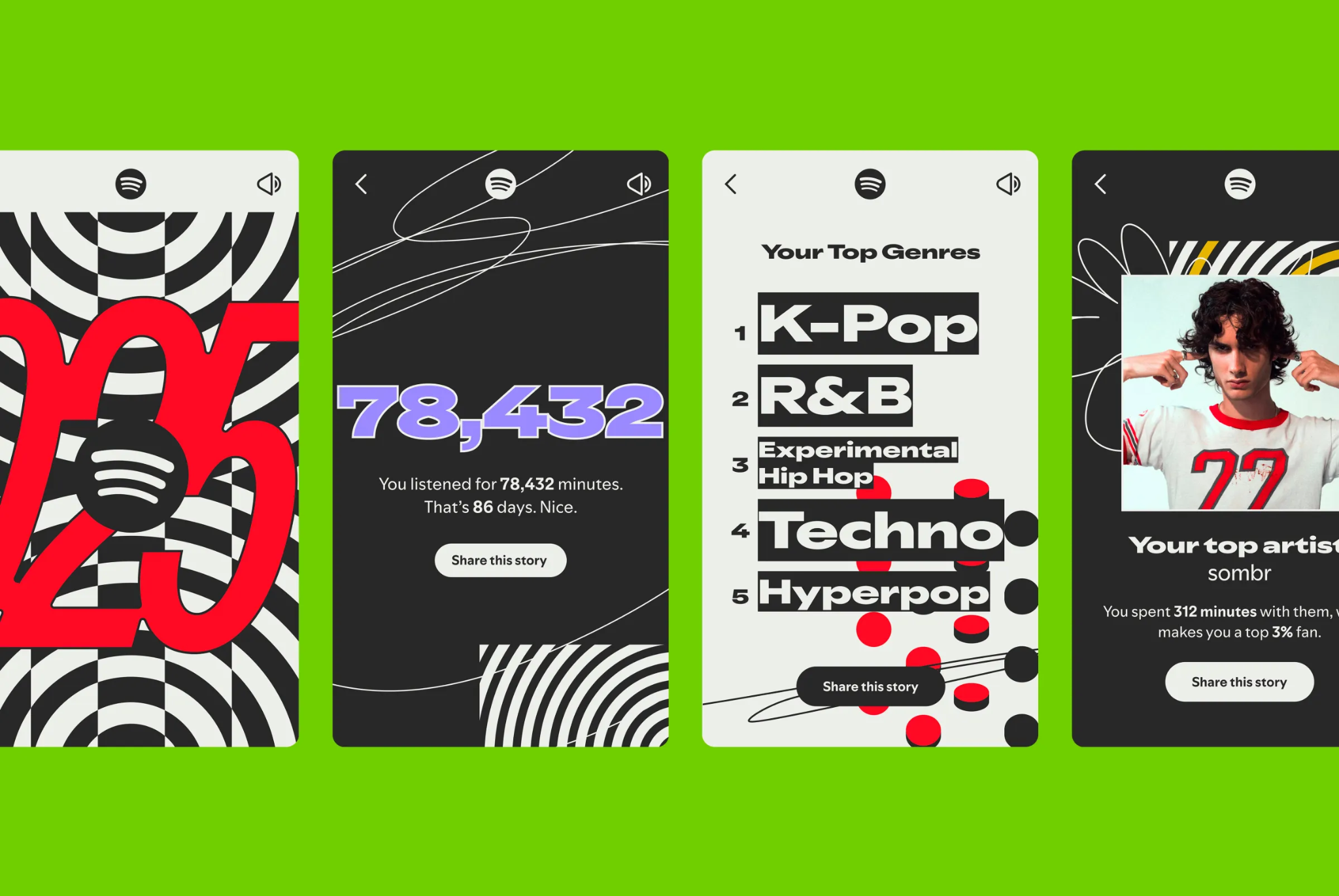
Example: Spotify Wrapped is the reference point every year. The whole system is built on huge, confident type and blocky color, and it is instantly recognizable before you read a single word. Pair strong type with the right font choices and you barely need imagery.
4. Vibrant color makes a comeback
After years of muted, beige, "quiet luxury" palettes, 2026 is swinging back to saturated color, unexpected pairings, and gradient blends. Bright color cuts through feeds full of neutral tones, which is precisely why brands are reaching for it again.
This is a direct reaction to sameness. When every app and brand looks softly minimal, loud color becomes the differentiator.
Example: Charli XCX's "Brat" campaign made a single acidic lime green a cultural event. It was deliberately ugly-on-purpose and impossible to ignore, and brands spent months borrowing the look. If you are rethinking your palette, our breakdown of social media color combinations is a good starting point.
5. Minimaximalism
Minimaximalism fuses two opposites: a clean, simple base layout carrying vibrant color, oversized type, and eclectic detail. You get the clarity of minimalism with the personality of maximalism, so the design stands out without turning into visual noise.
Superside flags this as a defining 2026 trend, tied to a real problem: nearly 40% of Gen Z say all apps look the same. Distinctive design is the fix.
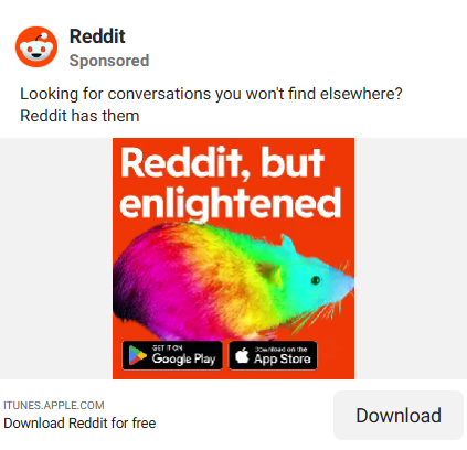
Example: Reddit's ad campaigns pair a stripped-back layout with a loud orange-and-yellow palette, bold type, and quirky animation. Simple structure, maximal energy. The trick is to be loud with the one or two things that make your brand recognizable and quiet with everything else.
6. Tactile, textured surfaces
Tactile design makes flat screens feel physical, using glassy, translucent, waxy, or hyper-realistic textures that look almost touchable. It is a reaction to years of flat, minimal UI, and it adds depth and craft to otherwise simple layouts.
Canva calls this "Texture Check," and searches for tactile styles like soft neutral backgrounds are up 30% year over year on its platform.
Example: Apple's Liquid Glass design language, introduced across its systems, pushed translucent, glass-like surfaces into the mainstream, and social designers have followed. Expect more frosted layers, realistic material effects, and depth in 2026 feeds.
7. Motion is the default, not the exception
Motion graphics are animated design: short bits of moving type, shapes, or simple animation that add life without a full video shoot. In 2026 motion is the baseline expectation for feed content, not a nice-to-have, because movement reliably out-performs static posts for reach.
You do not need a production crew. A looping animated post or a few moving elements is often enough, and it is far easier to make than filming.
Example: Instagram Reels consistently generate more reach than other post formats, and since you cannot post GIFs natively, even animated images surface as Reels. Our intro to motion graphics covers where to start.
8. Custom illustration as a human signal
Custom illustration is original, hand-crafted artwork made for your brand. As AI imagery floods feeds, custom illustration has become a deliberate signal of human effort and craft, which is exactly why it stands out more now than it did a few years ago.
Stock photos and generic AI images still have a place, but they blend in. A recognizable illustration style does not.
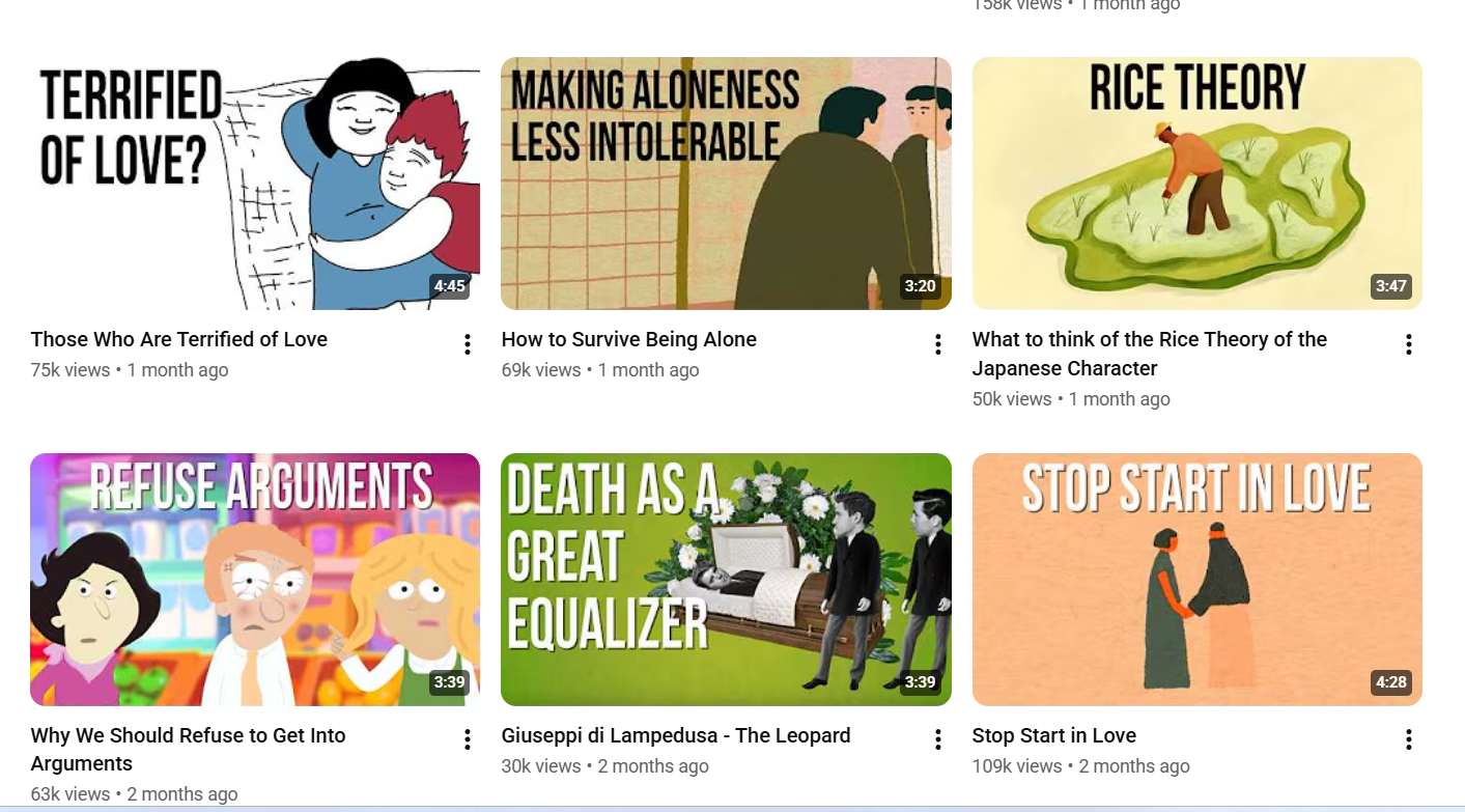
Example: The School of Life YouTube channel uses custom illustrated thumbnails that cut through a sea of face-based thumbnails. You know the channel from the style alone, before you read the title.
9. Interactive, zero-click content
Interactive content invites the audience to do something: vote in a poll, answer a quiz, swipe a carousel, or drag a slider. It drives engagement and gathers audience data, and the best versions are zero-click, meaning they keep users inside the platform rather than sending them away.
Interactive formats consistently out-engage static posts because participation beats passive scrolling. Polls and quizzes also hand you first-party insight into what your audience actually wants.
Example: Instagram Story polls and quiz stickers are the simplest entry point, and brands use them constantly to boost reach and learn preferences at the same time. For more, see our social media engagement tips.
10. Accessibility-first design
Accessibility-first design means building posts that everyone can use: high color contrast, readable font sizes, captions on video, alt text, and clear visual hierarchy. It widens your audience and, increasingly, it is what platforms and audiences expect by default.
This also quietly absorbs the old "design for dark mode" advice. Optimizing for contrast and legibility covers dark mode and accessibility in one move.
Example: Burned-in captions are now standard on brand video, because most people watch on mute and many rely on captions to follow along. Designing for the muted, glancing viewer is designing for accessibility.
11. Social platforms are the new search engines
More people, especially younger users, now search inside social apps instead of Google. That changes design: posts need to be discoverable, with keyword-rich captions, readable on-image text, and clear topics, not just pretty visuals that vanish after a day.
One study found that 72% of Gen Z equate "googling" with searching on TikTok. If your content is not built to be found, it only reaches your existing followers.
Example: Brands now write posts the way they would write a blog: front-loading the topic, using searchable keywords in captions and overlays, and answering a clear question. Treat each post like a tiny landing page. Our social media strategy guide goes further on this.
12. Social commerce that sells in the feed
Social commerce is buying and selling directly inside social platforms, with fewer redirects to external sites. For designers, that means product visuals, shoppable posts, and short-form video built to convert in-feed, not just to build awareness.
The scale is real. TikTok Shop hit roughly $17.5 billion in US sales in 2024, and around 130 million people engage with shoppable Instagram posts each month.
Example: TikTok Shop turned the app into a storefront, with creators demoing products and a checkout that never leaves the platform. If you sell online, your feed design now doubles as a product page. See our take on social media ecommerce ads.
How to choose the right trends for your brand
You do not need all twelve. The fastest way to waste a quarter is to chase every trend at once. Here is a simple filter:
- If your brand feels too corporate or stiff: start with imperfect by design and vibrant color.
- If your posts get scrolled past: lead with bold typography and motion.
- If you sell products: prioritize social commerce visuals and social-as-search discoverability.
- If you are using AI: adopt it, but build AI guidelines and disclose it.
The one rule that beats every trend: stay recognizably you. A trend that clashes with your brand does more harm than skipping it. Use trends to sharpen your identity, not replace it.
Keeping up with trends without burning out your team
The honest problem with a list like this is execution. Trends move fast, and producing on-brand, on-trend visuals across formats is a lot for one designer or a stretched marketing team. That is where an on-demand design partner helps: ManyPixels handles social media design across posts, carousels, motion, and illustration for a flat monthly fee, with unlimited requests and revisions. You get a consistent team that learns your brand, so trying a new trend does not mean a new hire. You can explore ManyPixels plans to see what fits.
{{SMD_PORTFOLIO="/dev/components"}}
Frequently asked questions
Bottom line
The 2026 social media design trends all point one direction: in a feed full of AI-perfect content, human and distinctive wins. Get the fundamentals right first, clear type, accessible contrast, motion, and a recognizable palette, then layer on the authenticity and personality that AI cannot fake. Choose the few trends that fit your brand and commit to them.
Need help turning these trends into actual posts? ManyPixels designs on-trend social content for a flat monthly rate, no credit card gimmicks, just a design team that learns your brand. Book a call if you want to talk it through.
{{SOCIAL_BANNER="/dev/components"}}

Having lived and studied in London and Berlin, I'm back in native Serbia, working remotely and writing short stories and plays in my free time. With previous experience in the nonprofit sector, I'm currently writing about the universal language of good graphic design. I make mix CDs and my playlists are almost exclusively 1960s.

Top-quality designers
A complete creative team at your fingertips: graphic and web designers, illustrators, and more.

Lightning-fast turnaround
Get start today and receive your first update on the next business day.

All-inclusive pricing
Unlimited requests and revisions. One flat monthly fee. No surprises.

Flexible & scalable model
No contract. Scale up and down as needed. Pause or cancel at anytime.
Continue reading

.jpeg)
Explore some of our best designs
Get inspired by a curated selection of ManyPixels work. Download the portfolio to see what our team can create.








