10 Icon styles that have changed the face of design

TABLE OF CONTENTS
TL;DR
Icon styles are the distinct visual approaches used to design icons, from pixel art and glyphs to flat, Material, 3D, and animated. This guide walks through 10 styles in the order they reshaped digital design, then shows how to pick one.
- ✅ Quick rule: match the style to your platform and brand personality first, legibility at small sizes second.
- 🎨 The 10 styles below trace icon design from the 1981 Xerox Star to today's animated and soft-3D icons.
- 👉 Skip to how to choose an icon style if you already know the styles, or the 2026 trends section for what is current.
Icons are the shorthand of digital design
Open any app on your phone and you are reading icons before you read a single word. A house means home. A magnifying glass means search. A gear means settings. These tiny symbols cross language barriers and do in one glance what a sentence would take longer to explain, which is exactly why the icon style you choose shapes how quickly people understand your product.
Here is the thing: an icon set is not just decoration. The style carries tone. A hand-drawn icon feels warm and human. A glyph feels precise and utilitarian. A soft-3D icon feels playful and modern. Pick the wrong one and you send the wrong signal, no matter how clean the drawing is.
This article covers the 10 icon styles that genuinely moved icon design forward, told in the order they appeared, because each one solved a problem the previous style could not. At ManyPixels, we design custom icon sets across most of these styles for our subscription clients, so the notes on where each style works are drawn from real project use, not just theory.
Icon styles vs icon types: what is the difference?
An icon style is the visual look of an icon, such as line, glyph, flat, or 3D. An icon type is its function or format, such as a universal icon (a magnifying glass for search), a unique icon (an app-specific symbol), or a file type like SVG. Style is about how it looks. Type is about what job it does and how it ships.
Most of this guide is about styles, since that is what shapes the feel of your interface. But the two overlap in practice: a "line" style icon is usually delivered as an SVG file, and a "universal" type icon like a home symbol can be drawn in any style. Keep both in mind when you brief a designer.
The 10 icon styles that shaped icon design
A style is a form of expression: the designer's vision turned into a graphic. The styles below appeared roughly in this order, and each pushed icon design somewhere new. Together they explain why the icons on your screen look the way they do today.
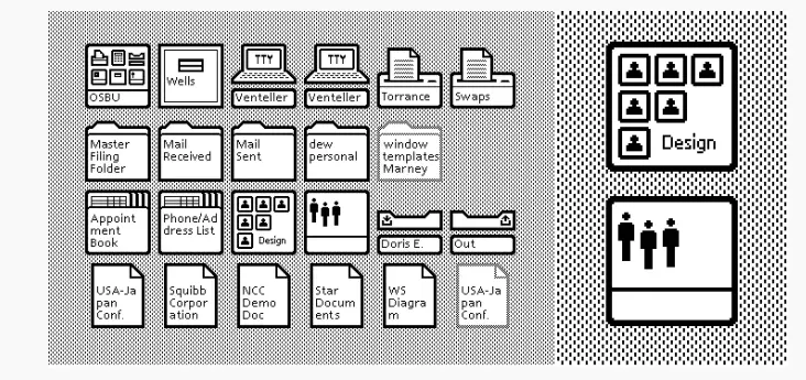
1. Pictograms and pixel art icons
Pixel art icons are built by arranging individual squares on a grid until a recognizable symbol appears, the very first icon style, created for the 1981 Xerox Star 8010. With monochrome displays and limited processing power, designers used hard black outlines and thinner inner lines to suggest shape with almost no detail.
The style has barely changed, and it is popular again thanks to the retro revival. Pixel art is not about cramming in detail. It is about making one clear, eye-catching symbol from the fewest possible elements. A simple airplane silhouette is still all you need to mark an airport.
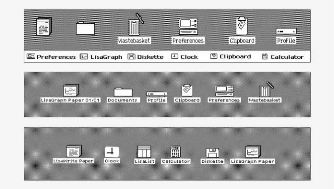
2. Ideograms - isometric icons
Isometric icons are two-dimensional drawings that appear three-dimensional, created by adding a third axis so flat symbols gain the illusion of depth. The style arrived with the Atari 520ST and its TOS operating system, which let designers suggest dimension while icons were still pixel-based.
It was evolution, not revolution, but it opened the door to depth in icon design. Isometric work looks straightforward and is anything but: your starting point is a rotating cube seen from a bird's-eye corner, usually on 30-degree horizontal lines. Done well, it adds personality and is great for feature illustrations, though it gets hard to read once the icon shrinks to UI size.

Isometric icon design is still in use today, but it has significantly evolved as you can see from the image below.

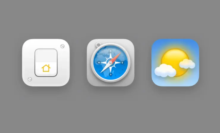
3. Skeuomorphic icons
Skeuomorphic icons mimic real-world objects with lifelike textures, highlights, and shadows, so a notes app looks like a paper pad and a camera icon looks like a camera. The style broke through on Steve Jobs's NeXT workstation and became mainstream when Apple's early iPhone filled the home screen with glossy, realistic icons.
At its peak, skeuomorphism was less an icon style and more an art form. The trade-off is weight: these icons carry a lot of visual detail, date quickly as tastes change, and can feel heavy next to simpler styles. It is a statement choice, not a default one.
Today skeuomorphism became more of an art form than a simple icon designing style. These icons feature life-like textures, highlights, and shadows, and they truly are a piece of art. This style became even more popular with the launching of Apple's iPhone.
4. Outline and filled icons
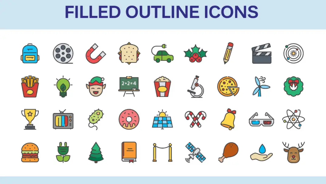
Outline icons use clean strokes to draw a shape, and filled icons add color inside that same outline, both descended from early pixel art but drawn with paths instead of squares. Swapping individual pixels for strokes made complete, consistent icon sets far easier to produce.
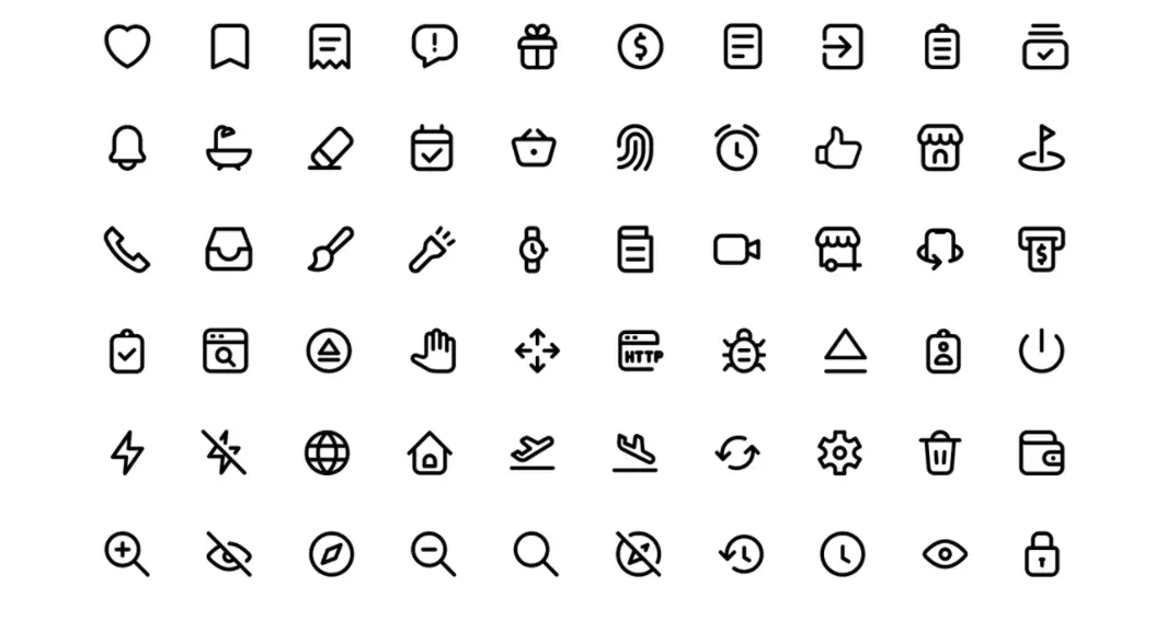
The only difference between the outline and filled line icon design is that filled icons incorporate the colors inside the basic outline design.
This is one of the most-used styles on the web today, and for good reason. Outline and filled icons carry strong meaning with simple shapes, scale cleanly, and pair well: outline for a default state, filled for an active or selected state. The risk is looking generic, so a small detail or a second accent color usually earns its keep.
5. Glyph icons
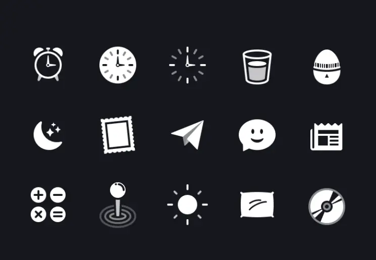
Glyph icons are precisely shaped, single-color solid symbols that can use negative space to separate parts, with no texture, shading, or highlights. The word comes from the Greek "gluphe," meaning symbol, and the style is about doing the most with the least.
Glyphs are simple and highly effective at small sizes, which makes them a natural fit for tab bars, sidebars, navigation, and toolbars. They also hold up well as favicons because a solid shape stays legible when shrunk. The downside is the same as their strength: on a bold, colorful layout a one-color glyph can look plain.
6. Flat icons
Flat icons strip away depth entirely, using bold color and geometric shapes with no shadows, gradients, or 3D effects. The style rose as a direct response to skeuomorphism, pushed into the mainstream by Windows 8, and quickly became the default look of modern interfaces.
The goal is instant clarity: show only the essentials and remove everything else. Most operating systems redrew their 3D icon sets as flat ones for exactly this reason. The style has since softened into "almost flat," adding subtle shading to bring back a little dimension without the weight of skeuomorphism.

7. Material icons
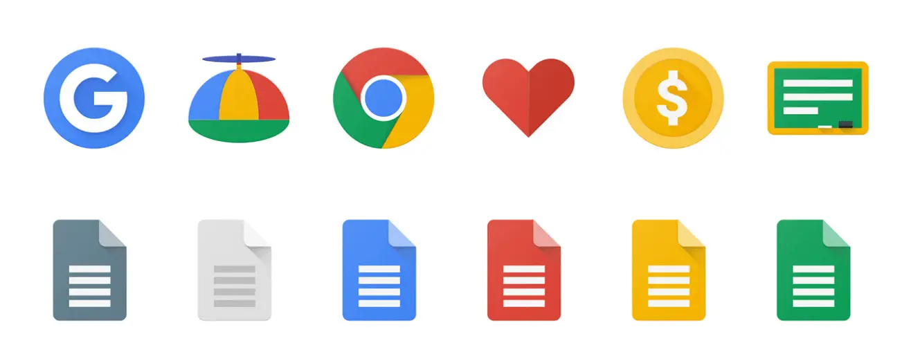
Material icons are Google's system of flat icons with subtle depth, using restrained highlights and shadows to suggest that surfaces are layered on top of one another. Google introduced Material Design in 2014 to sit between flat (too plain for its taste) and skeuomorphism (too busy).
The library runs to roughly 2,000 icons across categories like action, alert, and communication, each available in outlined, filled, rounded, sharp, and two-tone themes. It is the signature look of Google's products, but plenty of teams use Material icons well beyond Google's platforms because the set is consistent and free to use.
8. Dimensional icons
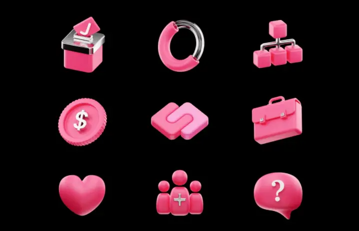
Dimensional icons add depth by showing the front and one side of an object, while full 3D icons render complete depth with shading, texture, and gradients so the symbol appears to pop off the screen. Both aim for a tactile, real-life feel that flat icons deliberately avoid.
These icons shine in social media graphics, hero sections, and anywhere you want an icon to grab attention. The current soft-3D trend, with rounded edges and pastel gradients, is this style's latest chapter. The catch is practical: 3D icons carry larger files and can lose legibility when scaled down to UI size, so keep the detail minimal at small sizes.
9. Hand-drawn icons
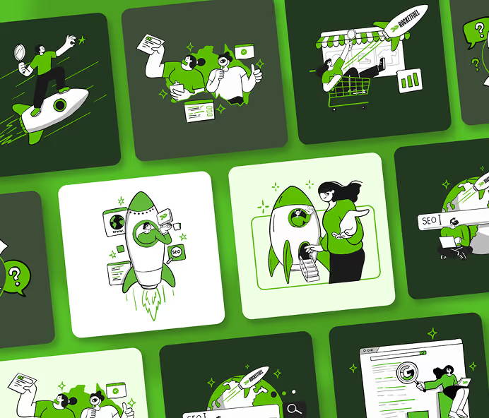
Hand-drawn icons use sketch-like lines and small imperfections to feel warm, personal, and human rather than computer-generated. Because each one is drawn by hand, the results tend to be genuinely unique, which is much of the appeal.
The style suits playful brands, marketing collateral, and landing pages that want to feel approachable. It is harder to pull off: it takes real drawing skill, and keeping a full set visually consistent takes discipline. That difficulty is also the payoff, since a hand-drawn set is tough for competitors to copy.

10. Animated icons
Animated icons are static icons brought to life with motion, moving on load, on hover, or in response to a tap to guide attention or confirm an action. At rest an animated icon can look like a plain flat icon, then reveal its personality the moment a user interacts with it.
Motion is increasingly common in UX, and icons are no exception. A subtle animation can signal that something is loading, nudge a user to scroll, or add a moment of delight during onboarding. The one rule: optimize the file. A heavy GIF slows a page, while lightweight formats like Lottie keep the motion without the performance cost. (See our take on motion graphics in UX.)
How to choose an icon style
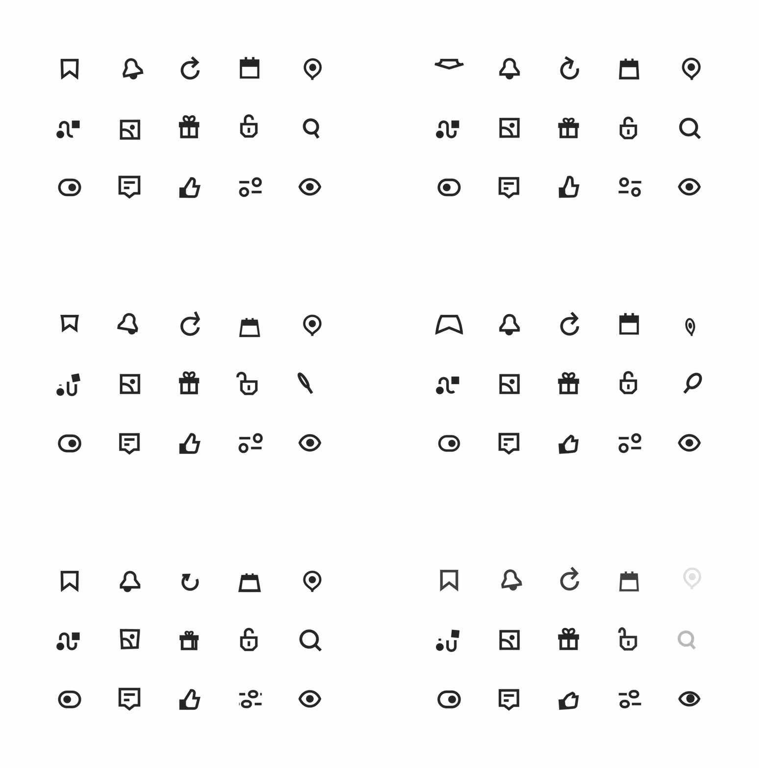
The right icon style is the one that fits your platform, your brand personality, and the sizes your icons need to work at. Start with function, then let personality break the tie. Here is the short version.
- If you are designing app or web UI, start with outline, filled, or glyph icons. They are legible at small sizes and read as clearly interactive. ✅
- If you are building for Android or a Google-style product, Material icons give you a consistent, ready-made system to extend.
- If your brand is playful or personal, hand-drawn or soft-3D icons carry warmth that flat and glyph styles cannot.
- If the icon is a hero element or social graphic, dimensional or 3D icons earn the extra file weight. For dense UI, they usually do not.
- If accessibility and performance matter most (and they should), favor SVG files for crisp scaling, keep contrast high, pair icons with text labels, and test legibility at your smallest real size. ⚠️
Whatever style you pick, consistency across the full set matters more than the style itself. A mismatched set of "nice" icons reads as sloppy, while a consistent set in a simple style reads as considered.
Icon design trends in 2026
The biggest icon trends in 2026 are soft-3D icons with rounded edges and pastel gradients, hyper-minimal line icons stripped to their thinnest form, and variable or animated icons that react to interaction. In short, icon design is splitting into two camps at once: warmer and more tactile on one side, cleaner and more restrained on the other.
Soft-3D borrows from the plush, friendly character design showing up across app stores. Hyper-minimal line icons go the other way, betting that clarity and speed win in dense interfaces. And variable icons, which shift weight or animate on interaction, bring the kind of wit that brands like Duolingo have made a signature.
We keep a dedicated, regularly updated breakdown of what is current: read the full rundown in our guide to icon design trends for examples and where each one works.
FAQ
Bottom line
Icon styles are not interchangeable. Each of the 10 here solved a specific problem, from fitting a symbol onto a 1981 monochrome screen to adding motion that guides a user's eye today. Pick by function first (where will the icon live, and how small will it get?), then let brand personality choose between the styles that pass.
If you would rather hand this off, a custom icon set is one of the request types our designers handle on a ManyPixels illustration and design subscription, so your icons stay consistent across every screen and channel. 👉 Explore ManyPixels plans to see how it works.

Privileged to be raised in the most beautiful city in the world, Novi Sad. Studied biology and ecology at the University of Novi Sad. A creative soul, travel enthusiast, passionate writer, and crazy dog lover. Proud mama of (for now :) ) one stubborn English Bulldog.

Top-quality designers
A complete creative team at your fingertips: graphic and web designers, illustrators, and more.
Lightning-fast turnaround
Get start today and receive your first update on the next business day.
All-inclusive pricing
Unlimited requests and revisions. One flat monthly fee. No surprises.
Flexible & scalable model
No contract. Scale up and down as needed. Pause or cancel at anytime.
Continue reading
.avif)
Explore some of our best designs
Get inspired by a curated selection of ManyPixels work. Download the portfolio to see what our team can create.