Trending icons: the top icon design trends for 2026
TABLE OF CONTENTS
TL;DR: icon trends for 2026 at a glance
- ✅ Gradients, soft 3D, and glassmorphism are the three styles dominating new app and web design this year.
- ✅ Minimalism is intensifying, not fading. The strongest icons now use one symbol and one accent color.
- ✅ Motion and dark mode are now defaults, not extras. Animated and dark-mode-first icons are becoming table stakes.
- ❌ Skeuomorphic realism and text-heavy icons are on the way out. They look dated and break at small sizes.
What are icon design trends?
Icon design trends are the recurring visual styles, techniques, and rendering choices that gain popularity across digital products in a given period. They cover everything from how an icon is shaped and colored to whether it moves, adapts to dark mode, or sits on a gradient. Trends matter because icons are one of the most repeated elements in any interface, so a dated icon set makes an entire product feel dated.
3D Icons
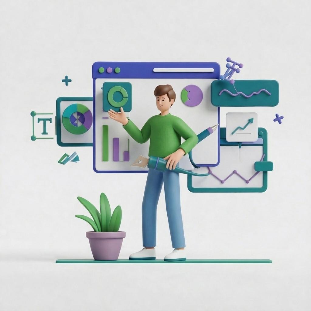
Soft 3D icons use rounded shapes, gentle shadows, and clay-like rendering to feel tactile without the heavy realism of early-2010s skeuomorphism. This is the evolution of the flat 3D look, and it reads as friendly and approachable rather than technical. It works especially well for products aimed at younger audiences or brands with a playful personality.
Remember that 3D does not have to be intricate to be effective. A few soft highlights and one confident color often do more than a heavily textured render, and they hold up better when the icon shrinks to thumbnail size. For productivity or finance tools, use 3D sparingly, since the playful feel can clash with a serious brand.

Minimalism, taken even further
Minimalist icons strip a symbol down to its essentials, and in 2026 that reduction is going further than ever. The strongest minimal icons now use a single recognizable shape and one accent color, nothing more. Think of the archetypes: a clean lettermark, a single geometric symbol, a lone silhouette that works at any size.
The payoff is clarity and longevity. Simple icons are easy to understand even when their meaning is not literal, and they rarely look dated. The risk for new brands is going so abstract that the icon no longer communicates what the product does. A recognizable category symbol rendered minimally is usually the safer bet. If you want to see how minimalism compares to other approaches, our guide to icon styles breaks down each option.
Line and hyper-minimal icons
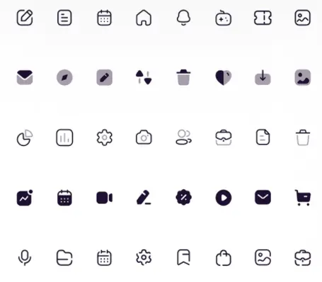
Line icons remain a reliable choice because the style pairs with almost any interface. The 2026 evolution pushes toward hyper-minimal line work: ultra-thin, precise strokes and clean geometry that stay legible at very small sizes. This makes them a favorite in dense interfaces like SaaS dashboards, productivity tools, and privacy or crypto products.
A small amount of color takes line icons further. A single fill or a soft color floating behind the outline ties the set together and can reinforce a brand color without adding visual weight.
Gradients
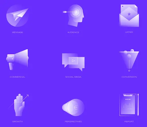
Gradients have become the most visible icon style in top-charting apps, adding depth and energy without the rendering cost of full 3D. The trick is restraint: the most effective 2026 gradients use analogous color pairs, such as purple to blue or orange to pink, rather than harsh complementary contrasts that get muddy at small sizes.
Keep the foreground simple. A gradient background paired with a clean white or light symbol creates strong contrast and reads clearly in a crowded grid. Pair a gradient with a busy foreground and you get visual noise that fails at thumbnail size.
Micro-illustrated icons
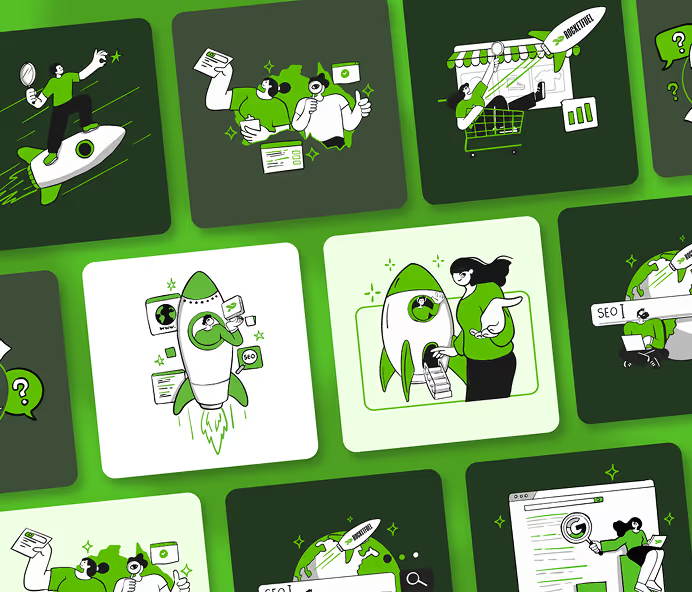
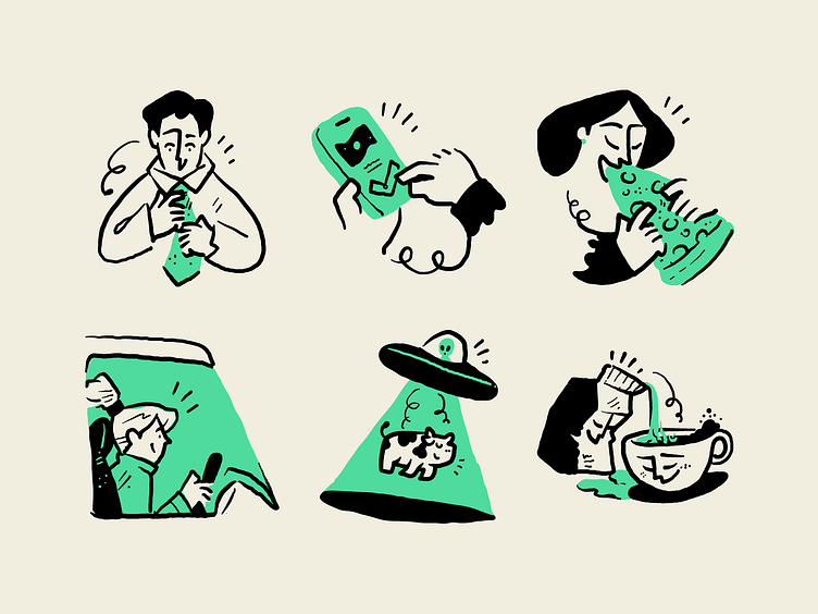
Micro-illustrated icons trade generic symbols for small, detail-rich moments of storytelling. As screen resolution keeps climbing, designers can pack more character into a single icon without losing clarity, which gives a product personality that plain symbols cannot. This style overlaps with hand-drawn and doodle looks, both of which lean into imperfect, human-feeling lines.
Micro-illustration shines on marketing sites and editorial layouts, where an icon has room to breathe and carry a little narrative. In our experience designing custom icon sets for clients, this is the style that most often makes a landing page feel bespoke rather than templated. Use it more carefully inside dense UI, where clarity has to win over charm.
Glassmorphism
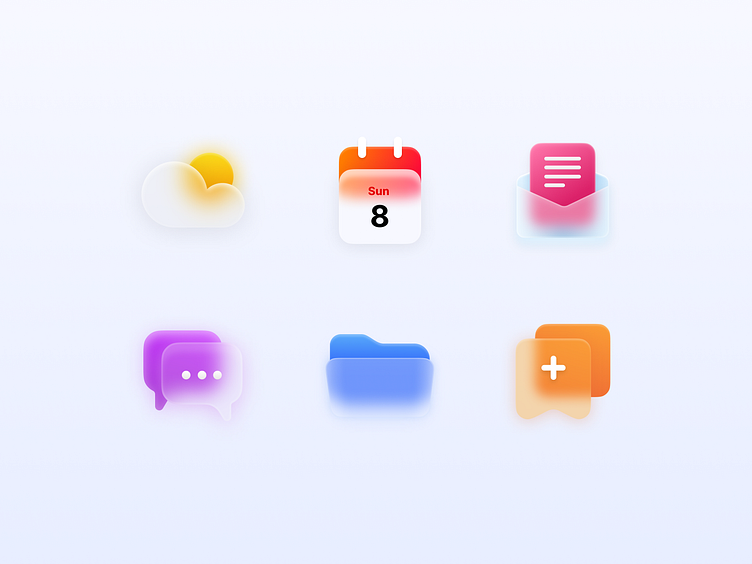
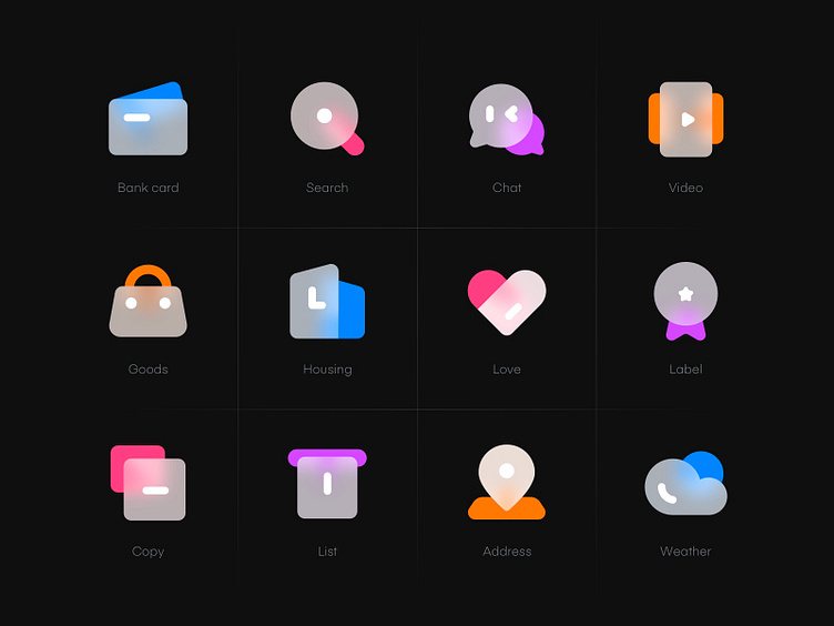
Glassmorphism gives an icon a frosted-glass look through translucency, blur, and subtle borders. Popularized by recent operating-system design languages, it has moved from UI backgrounds into icon design itself, and it signals a premium, modern feel favored by finance, productivity, and lifestyle products.
The catch is legibility. Glass effects can turn muddy at very small sizes, so the best implementations use strong borders and high-contrast foreground elements. Always test a glassmorphism icon at actual thumbnail size before committing to it.
Animated and variable icons
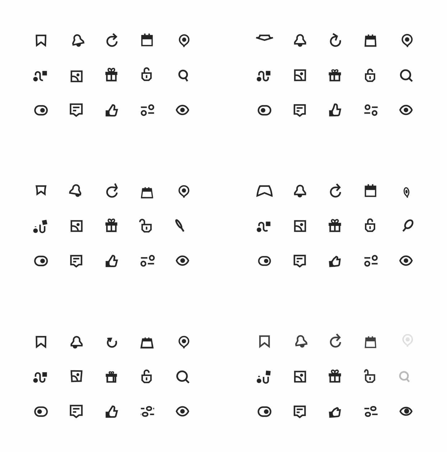
Animated and variable icons respond to context instead of sitting still. An icon might animate on tap to confirm an action, or shift subtly between light and dark mode, hover, and system states. Done well, this motion replaces extra interface copy and makes a product feel responsive and alive.
The rule is purpose over spectacle. Motion should communicate something, a state change, a confirmation, a transition, rather than decorate. Overdone animation adds noise and slows people down, so keep it short and meaningful.
Dark mode-first icons
Dark-mode-first design means creating icons that look their best on near-black backgrounds, then adapting them for light mode, rather than the other way around. With dark mode now the default for a large share of users, icons designed only for light backgrounds often look washed out in dark app drawers and store listings.
In practice this means choosing colors that pop against dark surfaces, (vivid accents, bright whites, saturated tones) and testing on both pure black and dark gray. If your platform supports themed monochrome icons, design that single-color version first so the shape carries the brand on its own.
Flat icons: the enduring baseline
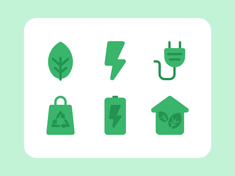
Flat icons are the longest-standing style on this list, and they are not going anywhere in 2026. Flat design uses simple two-dimensional shapes and clean color, stripping away textures and shadows for a clear, scalable result. It is less a cutting-edge trend than a dependable baseline that the newer styles build on top of.
If you need icons that work everywhere and age slowly, flat is still the safe foundation. Many of the trends above, gradients, soft 3D, glassmorphism, are essentially flat design with one extra layer of depth or motion added.
Which icon trends are fading in 2026
A few older approaches are losing ground and are best avoided for new work. Skeuomorphic realism, icons that imitate real objects with detailed textures, looks dated outside a few utility cases like calculators or compasses. Text-heavy icons keep declining, since app names already appear beside the icon and text turns illegible at small sizes. Busy backgrounds with patterns or photos compete with the symbol and get lost in a grid.
It is also worth clearing up two labels that often show up on trend lists but are not really trends. Circular and abstract are shape and concept choices, not styles of their own. A circle can hold a flat, gradient, or 3D icon, and abstraction is a decision about meaning rather than a look. Treat them as tools you apply within the styles above.
Which trending icon style should you choose?
Match the trend to your product, audience, and brand personality rather than chasing whatever looks newest.
- ✅ SaaS, productivity, or professional tools: minimalism, hyper-minimal line, or restrained gradients in professional colors.
- ✅ Consumer and social apps: gradients and glassmorphism, with bolder, more saturated color.
- ✅ Gaming and entertainment: soft 3D and vivid gradients that reward energy and personality.
- ✅ Marketing sites and editorial: micro-illustrated icons that add character and story.
- ❌ Any product: skip skeuomorphic realism and text-in-icon unless you have a specific reason.
For deeper guidance on getting the fundamentals right, see our icon design guidelines and our guide to iconography.
Need a custom icon set that fits the trend and your brand?
Icons are small, but they carry a lot of your product's personality, and getting a full set right takes time most teams do not have. That is where a design subscription helps. With ManyPixels, you submit as many icon requests as you need at a flat monthly price, with unlimited revisions until the set is right.
You get a professional designer who learns your brand, first drafts within 24 to 48 hours, and 100% ownership of everything delivered, in native source files.
Not sure you need it every month? You can pause your plan for $10/month and keep all your files.
See plans and pricing to get started.
{{ILLUSTRATIONS_PORTFOLIO="/dev/components"}}
Frequently asked questions
The bottom line
✅ If you take one thing from 2026, it is that depth and simplicity are winning together: gradients, soft 3D, and glassmorphism add richness, while minimalism keeps everything clean and legible. Pick the style that matches your audience, test it at real size, and design for dark mode from the start.
Icons have a real impact on how polished and current your product feels, so they are worth getting right. When you need a full set done fast and on brand, ManyPixels can help.

An experienced creative talent with a demonstrated history of working in the advertising industry for more than 18 years. A strong creative writing professional with a special focus on creating content for marketing and social advertising projects. I have a Master's degree in Theater Directing. I love hiking, enjoy obscure music and European cinema. I am an avid fan of UFC!

Top-quality designers
A complete creative team at your fingertips: graphic and web designers, illustrators, and more.
Lightning-fast turnaround
Get start today and receive your first update on the next business day.
All-inclusive pricing
Unlimited requests and revisions. One flat monthly fee. No surprises.

Flexible & scalable model
No contract. Scale up and down as needed. Pause or cancel at anytime.
Continue reading
.avif)
Explore some of our best designs
Get inspired by a curated selection of ManyPixels work. Download the portfolio to see what our team can create.